
Example: Create Conditional Formatting on a Column Chart
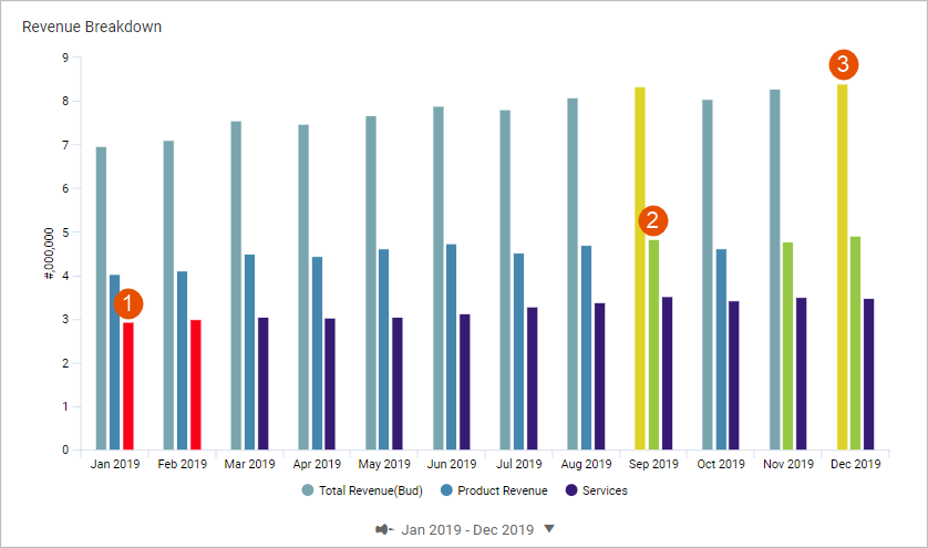
This walk-through shows you how to create conditional formatting rules on a column chart, where:
1 | Service Revenue data series is conditionally formatted to highlight Below Expectations.
|
2 | Product Revenue data series is conditionally formatted to highlight Above Expectations.
|
3 | Total Revenue data series is conditionally formatted to highlight As Planned Zone.
|
Prerequisites
Review Conditional Formatting before starting this walkthrough.
Prerequisites
- Edit access to a personal or shared perspective.
- This example assumes that a column chart exists in a dashboard using the default versionWorking Budgetwith the following two accounts and one calculation:
- Product Revenue (general ledger account)
- Service Revenue (general ledger account)
- Total Revenue: A calculation that sums Product Revenue and Service Revenue.
- Security:
- Access Dashboardspermission.
- Edit Dashboardspermission.
Create a Rule for Above Expectations
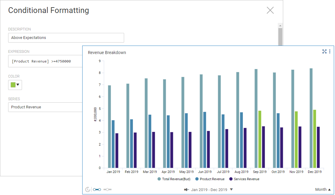
You will create a conditional formatting rule on the Product Revenue data series to highlight revenue that goes above plan. After completing these steps, you will have a conditional formatting rule and a column chart that looks like:
You can replace the hard coded value with an expression that references a data series in the chart. For example:
[Product Revenue] >= [Product Revenue] * 1.03
, where the right-side expression is a growth rate. You must reference a data series that is in the chart.- Create the First Rule
- In edit mode, go to the column chart.
- Click theAppearance Settingsbutton in the right panel and expand theConditional Formattingsection.
- SelectAdd rule. A dialog displays.
- Define the rule. See syntax rules and list of operators and functions.
- Provide a description:Above Expectations
- Build the expression:[Product Revenue] >= 4750000
- Pick the highlight color to format data points when the condition is true.
- Select the series:Product Revenue
Create a Rule for Below Expectations
You will create a second conditional formatting rule on the Service Revenue
data series that highlights revenue that goes below plan.
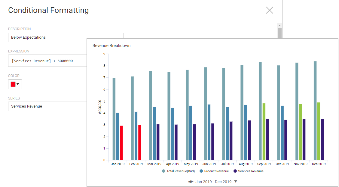
After completing these steps, you will have a conditional formatting rule and bar chart that looks like:
- Build a Second Rule
- In the same chart, selectAdd rule. A dialog displays.
- Define the rule:
- Provide a description:Below Expectations
- Build the expression:[Service Revenue] < 1250000
- Pick a highlight color.
- Select the data series:Service Revenue
- Change the Data Series Name
- The data series name for services revenue is too long and makes the chart look cluttered with data labels. You can shorten the name of the data series referenced in a conditional formatting rule without breaking the rule. When you change the name in the data series, the name changes in the rule too.
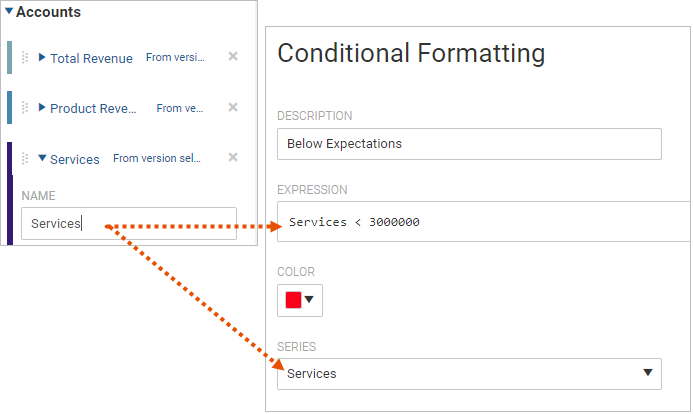
- Click theData Settingsbutton in the right panel and navigate to the Accounts section.
- Expand the data series:Services Revenue
- Change the name:Services
The name changes on the chart data label and the conditional formatting rule now references the renamed data series.
Create a Rule for an As Planned Zone
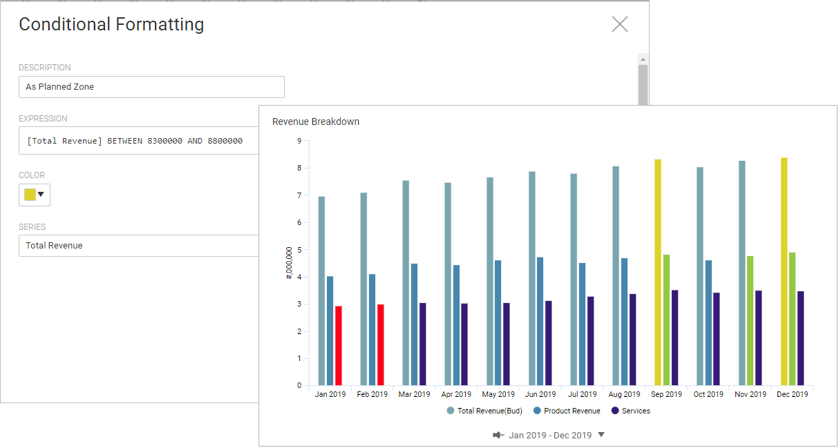
You can create a conditional formatting rule that evaluates data that falls within a range of values. You will create a rule that will highlight data points that are tracking "as planned."
After completing these steps, you will have a conditional formatting rule and a column chart that looks like:
- Click theAppearance Settingsbutton in the right panel and expand theConditional Formattingsection.
- SelectAdd rule. A dialog displays.
- Define the rule:
- Provide a description:As Planned Zone
- Build the expression:[Total Revenue] BETWEEN 830000 AND 880000
- Pick a highlight color.
- Select the series:Total Revenue
This completes this walk-through.