
Example: Set Up a Primary and Secondary Axes on Charts
Most charts consist of an x-axis and a y-axis, which are often enough to tell a complete data story. In some cases, a secondary axis is required, such as when you want to visualize the data of one series relative to another data series.
The following chart shows ending
cash balance
as the primary axis and net cash flow
as the secondary axis. Showing both axes in this chart provide a more complete story around ending cash balances compared to net cash flow. Only the secondary axis scaled.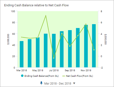
You can configure bar, column, and line charts with a secondary axis. This article will explain
how to set the primary and secondary axes and adjust the scale.
Prerequisites
You will
need:Prerequisites
- Edit access to a personal or shared perspective.
- Security:
- Access Dashboardspermission.
- Edit Dashboardspermission.
This example focuses on setting up a column chart with a primary and secondary
axes and assumes that the perspective and dashboard were previously created. This
example visualizes data using Actuals as the default version. This example uses the
following custom account and sub-accounts:
- Cash Flow Accounts
- Ending Cash Balance
- Net Cash Flow
Your versions and
accounts may be different than the ones illustrated in this
example.
Create a Column Chart
The following is an example of a column chart with two
data series where both accounts are on the primary axis. You can improve the readability
of this chart by defining a secondary axis. After completing these steps, you will have
a chart that looks like: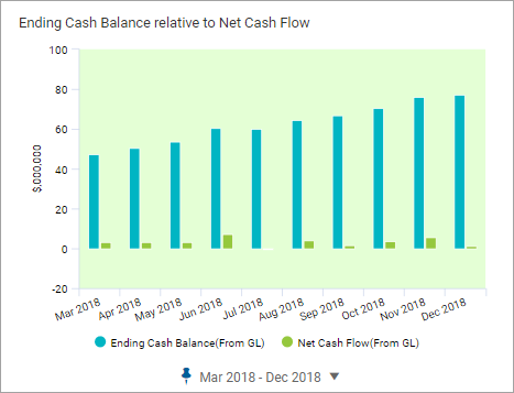
- Open the perspective and navigate to the dashboard.
- ClickEdit.
- From the left panel, drag aColumnchart to the design area to create a column chart.
- Add two accounts to the charts.
- Custom > Cash Flow Accounts > Ending Cash Balance
- Custom > Cash Flow Accounts > Net Cash Flow
- From the right panel, select theAppearance Settingstab to access the appearance settings and give your chart a name:Ending Cash Balance Relative to Net Cash Flow
- Select theTime Settingstab to access the time settings and change the date range for 9 months in the current year. For example:
- Stratum: Month
- Span: Range
- Pinned date: March 2018 - December 2018
Set up Primary and Secondary Axes
When creating a chart with a primary axis
and secondary axis, determine which data series is the primary and secondary axis. In
this example, Ending Cash Balance is the primary data set. You want to visualize the
ending cash balance compared to the net cash flow. The net cash flow in this example is
the secondary axis.Use the Data Settings tab to specify an account as a primary axis
or secondary axis and to change the some of visual presentation of that data. For
example, change the series type, show data labels, and change the color representing
the data.
Define the Secondary Axis
You will define the
Net Cash Flow data
series as the secondary axis and change the series type to Line
. After completing these steps, the chart will look like: - Select theData Settingstab to access data settings.
- Change axis for theEnding Cash Balancedata series:
- Series Type:Line.
- Series Y Axis:Secondary
- Adjust the Scale of the Secondary Axis
- You can adjust the scale of the primary and secondary axes from the Appearance Settings tab to enhance the visual impact of this chart. For this walkthrough, change only the scale of the secondary axis.When setting the scale of an axis, keep the following in mind:
- By default, an axis is set to auto scale. Make note of the minimum and maximum values on the axis before turning off Axis Auto Scaling. This information will help you set the minimum-maximum for the data series.
- Adjusting the minimum and maximum values between two distinctly different data ranges may be necessary to achieve the visual result that you are looking for.
Change the scale of the secondary axis:- Select theAppearance Settingstab and expand theAxissection to change the appearance of the secondary axes.
- Configure the secondary axis:
- Make note of the value range: Example: -2 to 8 (million)
- Set the Secondary Axis Auto Scaling to off.
- Set the Secondary Axis Minimum. Example: 0
- Set the Secondary Axis Maximum. Example: 20000000
This completes this walkthrough.