
Example: Create a Waterfall Chart by Breaking Down Data by Location
A waterfall chart shows where you started, where you ended, and how you got there. You can set up a waterfall chart by specifying a start value (reference value) and an end value (comparison value) and the waterfall steps. You can breakdown waterfall steps by time, dimension, or metric.
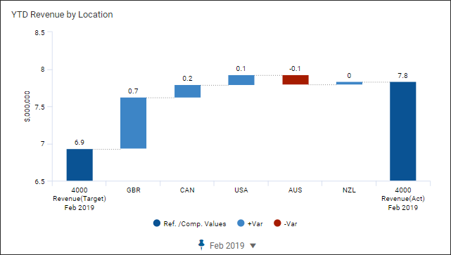
The following visualizes a year-to-date revenue waterfall chart by location:
Prerequisites
You need:Prerequisites
- Edit access to a personal or shared perspective.
- Security:
- Access Dashboardspermission.
- Edit Dashboardspermission.
This example focuses on setting up a waterfall chart and assumes that the
perspective and dashboard were previously created. This example visualizes data
using
Targets - Board Approved
as the default version. This example uses the
following account and dimension:- Actuals as the comparison version
- GL Accounts > Revenue
- Location dimension
See Reference: Waterfall Chart
Settings for setting options and descriptions.
Create a Waterfall and Add the Data Series
After completing these steps, the
chart will look like: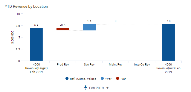
The current breakdown is by
product-subcategory. You will change the breakdown in a later step.
- Open the perspective and navigate to the dashboard and clickEdit.
- From the left pane, select theCharttab.
- Drag and dropWaterfallto the design area to create the waterfall chart.
- Select theAccountstab. Drag and drop theRevenueaccount to the chart to add a data series.
- In the right pane, click theAppearance Settingstab. Expand the General section and rename the chart to:YTD Revenue by Location
- Click theTime Settingstab and change:
- Stratum: Month
- Pinned time: February 2019
Define the Waterfall
You will change the breakdown to location and specify
the waterfall reference and comparison values. After completing these steps, the chart
will look like:- Change the Breakdown
- Select theData Settingstab and navigate to the Breakdown section and change:
- Type: Dimension
- Dimension:Locationas the dimension value.
- Expand the Sorting & Limits section and change:
- Max Data Points: 6
- Sort Order: Largest to Smallest (Absolute)
- Set the Reference and Comparison Values
- Select theAppearance Settingstab.
- Expand the Axis section and changeAxis Start from Zeroto off.
- Review and make note of the Reference Value section. The default settings uses the default version,Targets - Board Approved, and look at the current period based on the time settings on this chart. No change is required.
- Version: From version selector:Targets - Board Approved
- Time Alignment: Current
- Period: Year
- Data Range: To Date
- Expand the Comparison Value section and change:
- Version: Actuals. You will compare actuals to your targets.
- Time Alignment: Current
- Data Range: To Date
This completes this walkthrough.