
Data Visualization
Overview
Workday offers visualizations of custom report data by using analytic indicators and charts. The system's chart features provide powerful visual representations of data to use for analytics. Custom matrix reports, paired with chart outputs, allow the customer to take advantage of their data, derive meaning and insights, visualize, interact, and make smart decisions.
Objectives
By the end of this chapter, you will be able to:
- Add analytic indicators to visually categorize and represent the data.
- Explain the different charting options.
- Add a column chart to a matrix report to analyze the data.
Analytic Indicators
Analytic indicators provide visual identifiers in Workday that:
- Categorize and represent data.
- Indicate status.
- Display ratings.
- Monitor thresholds.
- Illustrate progress.
- Highlight data exceptions.
You can configure analytic indicators on a given field for a business object. The indicators are then available for use in any report that displays the field in the report output. Alternatively, you can create report-specific analytic indicators that are only available on that report. This option is useful when the analytic indicator applies to a report-specific field such as a matrix summarization, or a report-specific calculated field.
Types of Analytic Indicators
Several visualization types are available:
Visualization Type | |
|---|---|
Flags allow the user to configure the meaning of each flag color in the custom report. | 
|
Trend arrows visually highlight data that exceeds or falls below specified limits. | 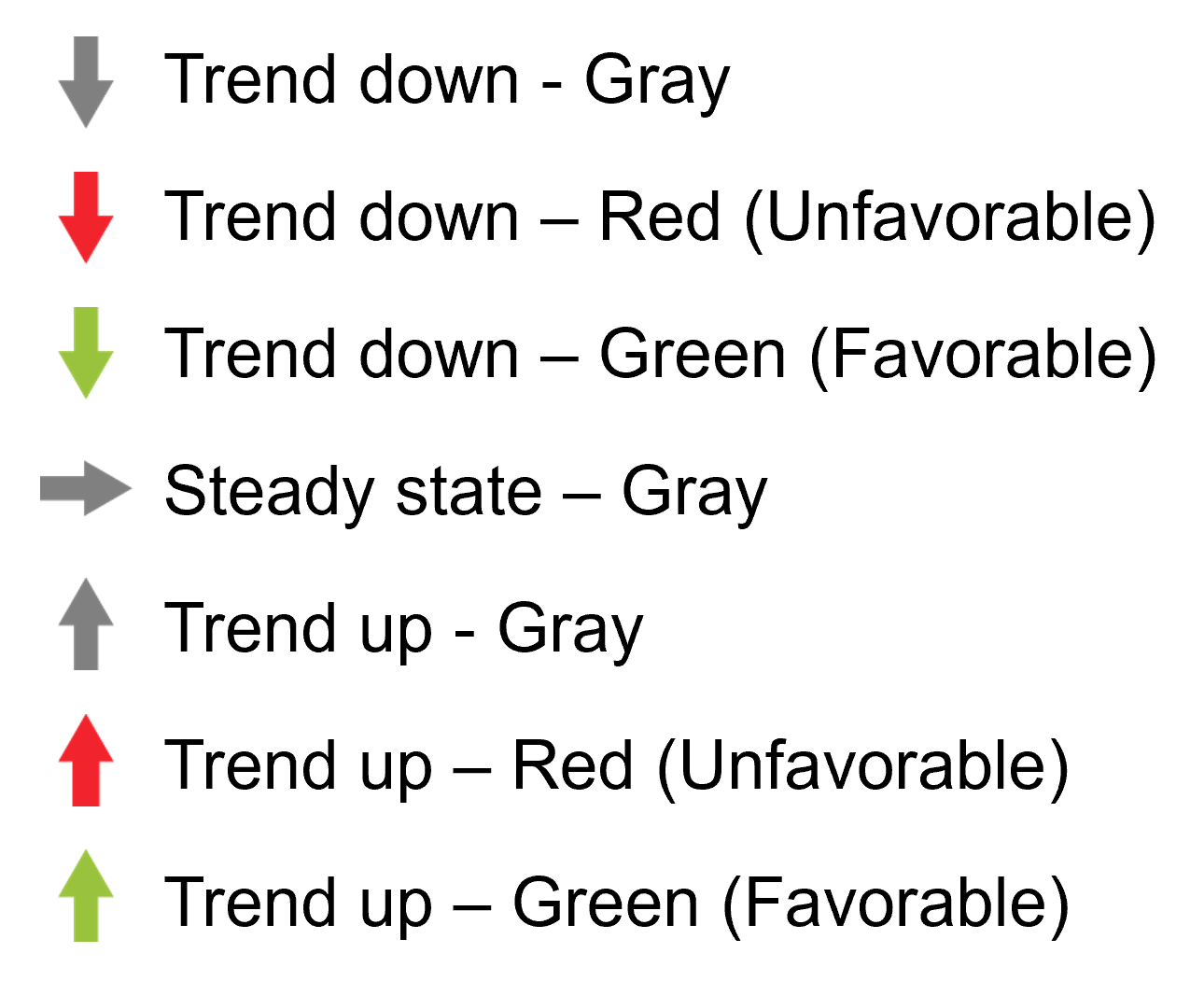
|
Progress Bar | 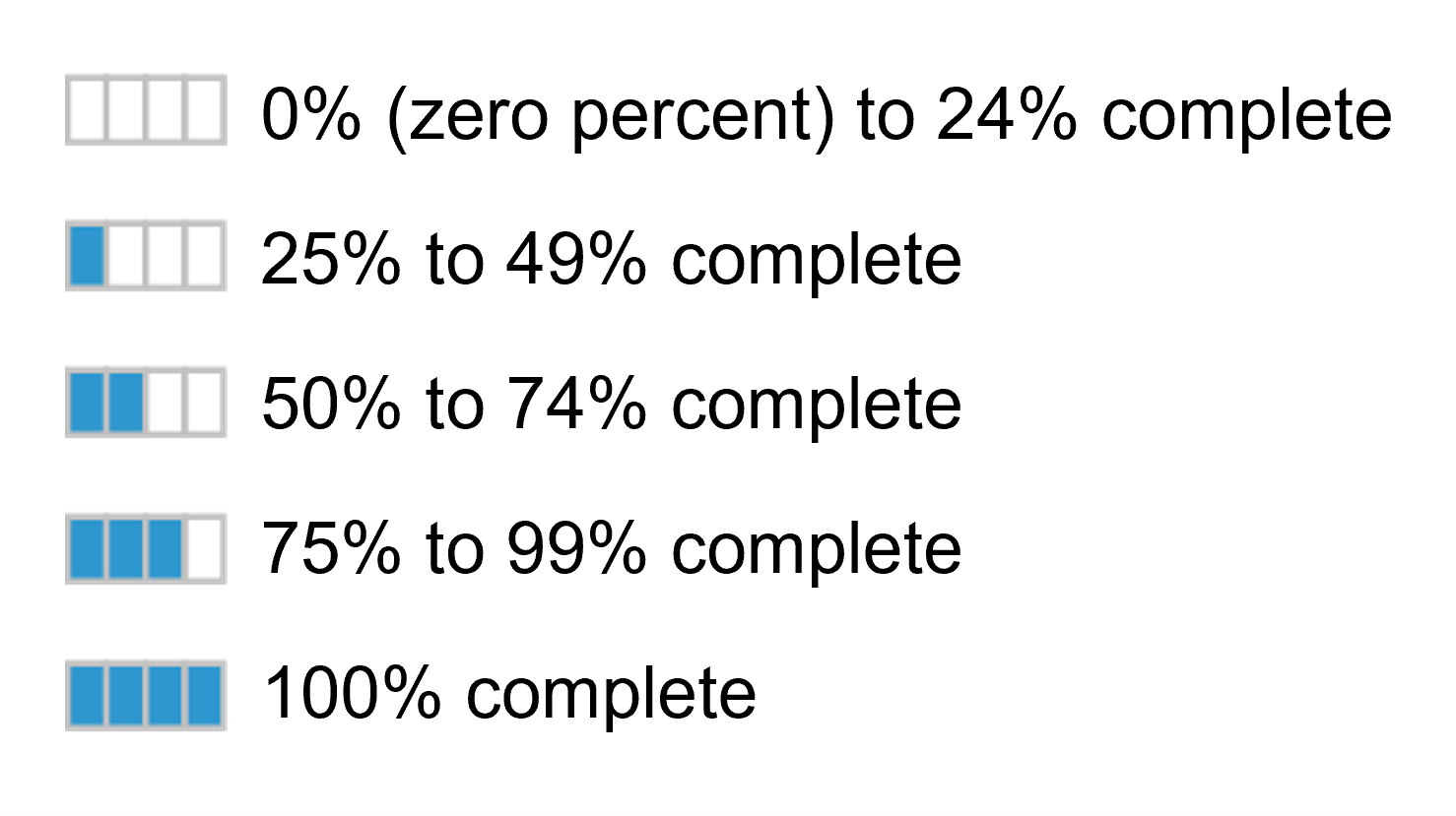
|
Checkmark or X represents true/false values. | 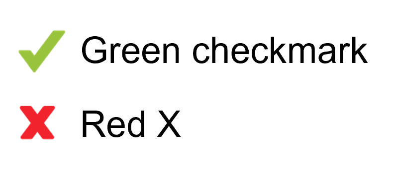
|
Status demonstrated as green, yellow, or red; or use a star-rating based on five stars. | 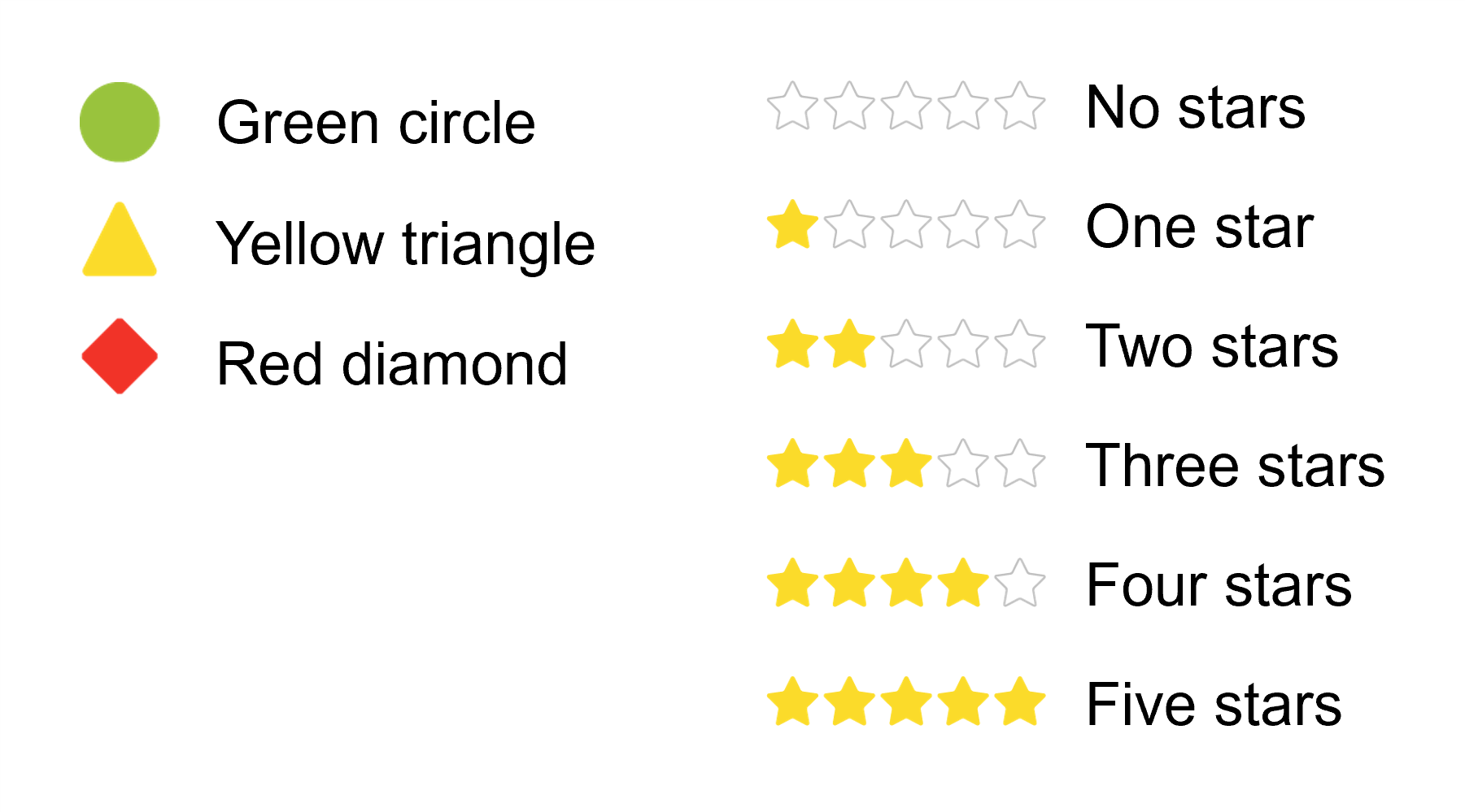
|
nBox | 
|
Creating Analytic Indicators
You can use any of these tasks to create system-wide analytic indicators:
- TheCreate Analytic Indicatortask to create the indicator.
- TheView Analytic Indicatortask to view the configuration of the indicator and where the indicator appears in the tenant.
- TheEdit Analytic Indicatortask to modify a global analytic indicator.
You also have the option to create system-wide analytic indicators from the Options column of a report definition.
Report-specific | Tenant-wide |
|---|---|
Apply to a specific case in a report. | Configured on a field. |
Only available on the report. | Available on any report containing the field. |
Create an Analytic Indicator for Report in the Options column of a field in the report definition. | Create Analytic Indicator task. |
To create report-specific analytic indicators:
- Go to the Options column of a field in the report definition.
- SelectCreate>Create Analytic Indicator for Report.
To modify a report-specific analytic indicator:
- Locate the business object in the report definition.
- Select theRelated Actionsicon, and selectEdit.
The Analytics Data: Report Fields and Values security domain secures the tasks to create and modify analytic indicators. Any report writer can apply an existing analytic indicator to their custom report if granted access to the report field.
When creating analytic indicators, keep in mind that:
- The analytic indicator rule can only use simple conditional rules. To deploy more complex conditional rules, you would need to use calculated fields.
- You can only specify one analytic indicator for a column on a report.
- You can define analytic indicator for advanced reports, for total lines on aggregated fields.
- Only a matrix report displays analytic indicators on summarizations and in detail data.
- The system evaluates the conditions in the order listed. The order may be important in achieving the desired results since the system does not allow users to create complex rules.
Charts
With one set of data, you can create a wide variety of charts. Workday makes it easy to experiment with different variables and chart types to tell a story and deliver charts to report users.
The chart options available depend on the configuration of the report definition. Workday makes charts available for advanced, matrix, trending, and composite report types. Also, the system displays charts alongside a table or on their own. A variety of chart options are available when you specify a chart as the output type.
Chart Options
The chart options available depend on the configuration of the report definition and the chart type you specify.
Typically, the system requires a vertical or horizontal axis definition, as well as a legend. For matrix reports, indicate which metrics from the Define Field(s) to Summarize section to include in the chart.
Interacting with Charts
Report types that support charting allow you to dynamically interact with report output after executing the report. You can select the configure icon to configure and view various chart options, even if you did not configure chart options in the report definition.
Chart legends are automatically interactive, so users can focus on a specific metric or dimension. Users can also zoom in and pan their view of a report output.
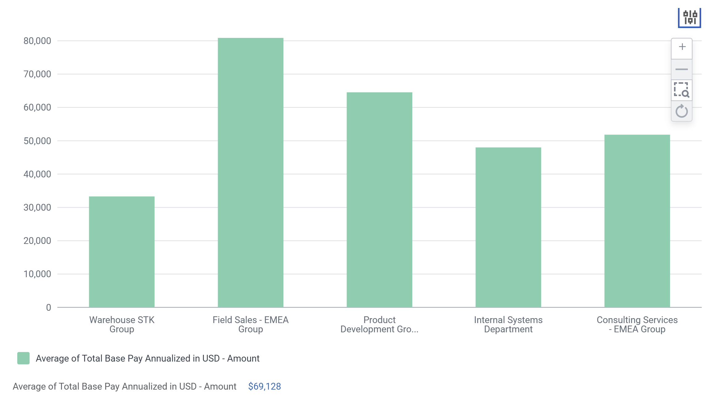
The Configuration Panel allows you to make modifications in the chart view. Adjust variables such as the horizontal axis, legend, and metrics. These options are useful when the report has multiple metrics that interact in different ways.
Access the Configuration Panel using the following steps:
- Select theConfigureicon at the top right.
- Choose a different chart type if needed.
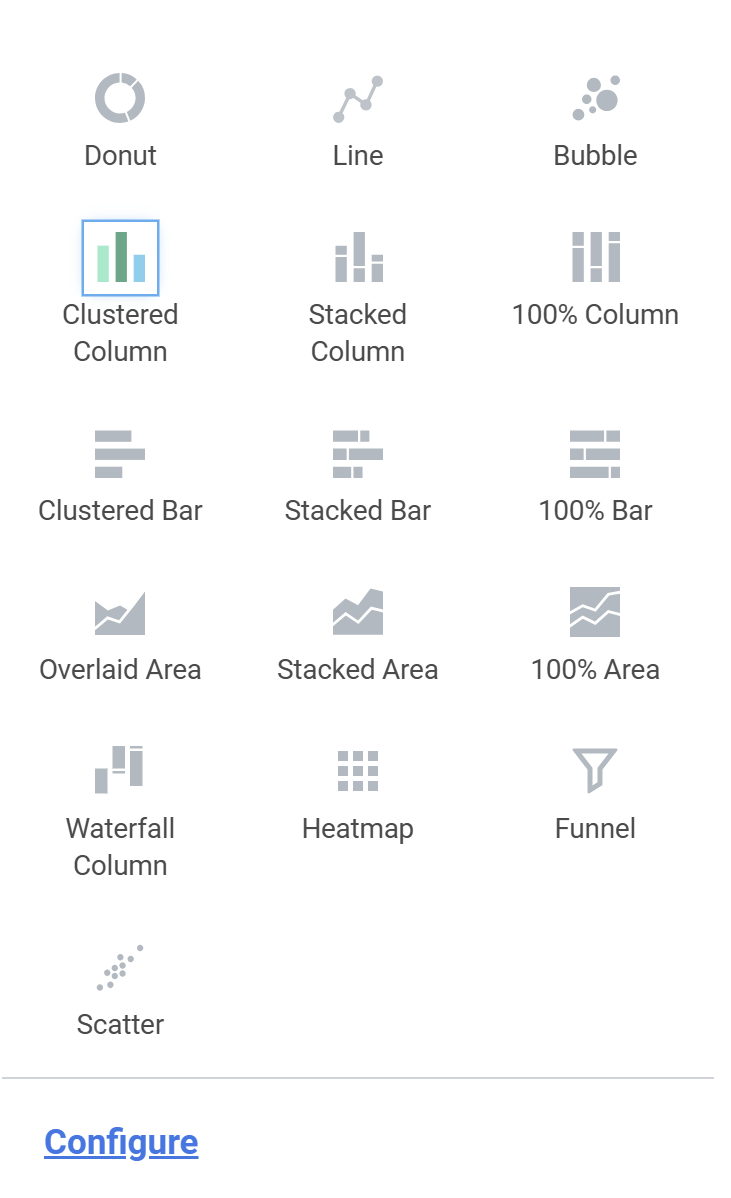 Note:The Waterfall Column chart option is only available on Matrix and Trending reports.
 - SelectConfigure.
- Interact with Variables to view data from different perspectives.
- SelectAdvancedto further interact with the report output.
Charting Options
The advanced chart features offered by Workday provide more analytical tools to help you gather meaning from your data:
- Top n Values
- Target Line
- Vertical and Horizontal Axis Scale
- Advanced
Top n Values
Top n Values dynamically filter the values displayed on the horizontal axis. Doing so the chart output includes only the top number of values sorted by the Top n Field. You can also choose to sum the remaining values.
Top n tool is available for both the report owner when configuring the report definition and anyone viewing the report output. The report owner can configure a baseline Top N value in the report definition under Chart Options > Top n Values.
Anyone authorized to run the report can then interact with these settings by expanding the advanced section from the Configuration Panel. A new pane displays, providing the option to modify the Top n Values as well as modify other advanced configuration options.
Example
: Consider the compensation chart in the image below. Use the Top n setting to dynamically filter the Supervisory Organizations with the highest compensation values. In the image on the top right, the system analyzes the top 10 values and not summarizing the remaining values. In the second image using the configuration options, the system further refines values to the top 5.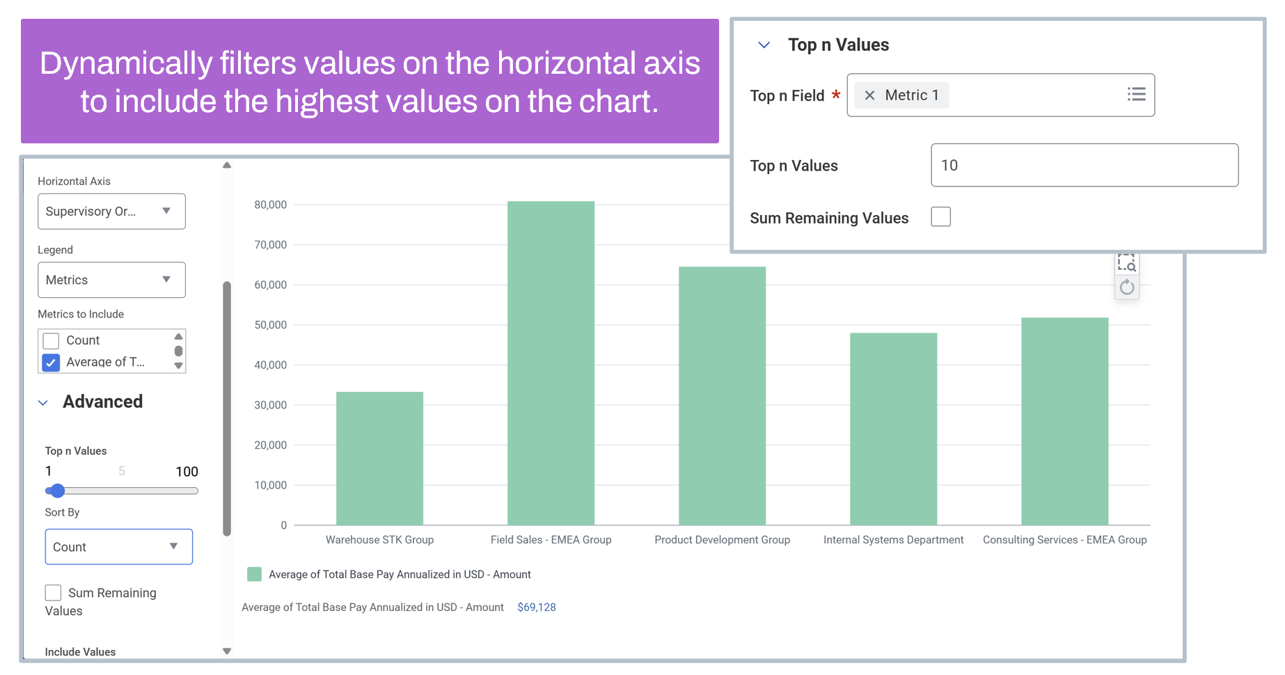
Target Lines
Target Lines compare values in the output with a target value to visually highlight deviations from the target. You can use target lines with bar and column charts (in particular, clustered, or stacked).
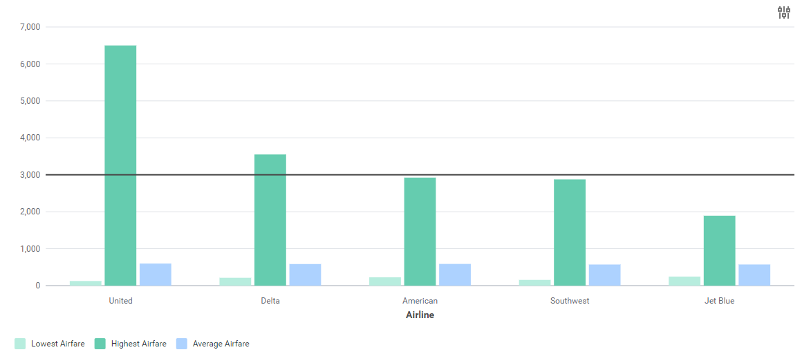
You can create target lines as the report owner but not as the report user at runtime. There are two types of target lines:
- Single Target Line: Use when target value is same for each value on the horizontal axis.
- Multiple Target Lines: Use when targets are different for each value on the axis.
To set up a single target line:
- Access the Output tab of the report definition.
- Select Chart Options.
- Select Target Line.
- Select Display one target line for all groups and enter value.
- Provide a Target Line Label if necessary.
Multiple target lines are available for matrix, trending, and advanced report types. This feature displays a unique target line for each group displayed in a column or bar chart. Identify the specific measure or metric to use as a target value when creating the report definition.
To set up multiple target lines:
- In the Define the Field(s) Summarize section of the Matrix tab, include at least one numeric or currency field to summarize, and one numeric or currency field to use as a target line.
- SpecifyUse as Target Linein the options column to use the summarization as the target.
- Select theOutputtab and select Chart Options.
- SelectTarget Line.
- SelectDisplay multiple target linesfor each group.
Vertical & Horizontal Axis Scale
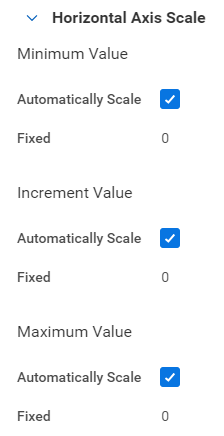
The Axis Scale sections allow you to control the scaling of the vertical and horizontal axis when the axis value is numeric. Set a fixed length for the minimum, maximum, and increment values. Advanced reports do not support axis scale controls (except for scatter charts).
Advanced Chart Options
The Advanced section of Chart Options provides additional controls for charts:
Chart Options | Additional Options |
|---|---|
Axis titles | Define chart and axis titles |
Total and Legends | Suppress total and legends |
Donut Charts |
|
Line Charts |
|
The options available depend on the chart type specified. For example, "smooth line" is only available when using a line chart.
Chapter Summary
- Use analytic indicators to visually categorize and represent data in your report output.
- The chart options available for a report depend on the configuration of the report definition and the chart type specified.
- Use charts to:
- Compare sets of data.
- Compare data over time.
- Examine the parts of a whole.
- Compare data to a target.
- Compare the relationship between values.