
Example: Sort and Limit Data in Charts
Sorting and limiting data on a chart helps you focus on key data points. You can analyze top or bottom performers that can help you uncover root causes and take action on them. Sorting and limits work best with area, bar, column and line charts with breakdown by dimension.
- Sorting data lets you organize and list data in ascending or descending order. For example, you can view revenue by highest performing sales people or view lowest selling product by location.
- Adding limits let you display only the topNor bottomNof a whole set of data. For example, you view the top 5 highest performing sales people or the 5 lowest selling products by location. It is possible to apply a filter to a data and then sort and limit of that filtered data.
This article explains how to create a bar chart that visualizes product sales for Q1. You will sort by revenue and limit data to the top five performers and bottom five performers. After completing this walkthrough, you will have a bar chart that shows top sales from highest to lowest and a bar chart that shows bottom sales from lowest to highest.
Prerequisites
Prerequisites
- This example uses the default versionWorking Budget,aRevenuecube account, and aProductdimension.
- Edit access to a personal or shared perspective.
- Security:
- Access Dashboardspermission.
- Edit Dashboardspermission.
Your versions and data sources may be different than the ones illustrated in this example.
Navigation
 Navigate to
 Dashboards
View the perspective and select
Edit
and navigate to the dashboard where you will create the chart.Create and Set up a Bar Chart
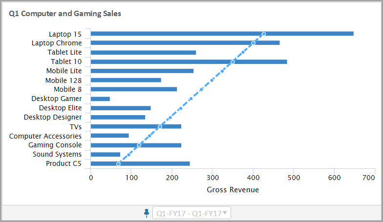
You will create a bar chart that shows revenue for the electronics department of a retail outlet.
After completing these steps, you will have a bar chart that looks like:
- Create a Bar Chart
- In edit mode, select theChartsbutton In the left panel. Drag and drop theBarchart to the design area.
- Click theAccountsbutton to view a list of accounts. Expand Cube accounts and drag a revenue account to the chart.
- Change Time Settings
- In the right panel, click theTime Settingsbutton to change the default time of the chart.
- Change the Stratum. SelectQuarterfrom the drop-down.
- Keep the Span default (no change is required).
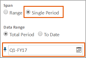
- Pin and set time to an specific period. ThePinicon is blue when pinned and gray when unpinned.
- Change the period to show only Q1.
- Change Appearance Settings
- In the right panel, select theAppearance Settingstab to change the appearance of the chart. Rename the chart toQ1 Computer and Gaming Sales
- (Optional) Experiment with theseAppearance Settings:
- Axis > Primary Axis Title: Account Name
- Legend > Legend: Turn off (do not display the Legend)
- Change Data Settings
- Select theData Settingstab to edit the data settings.Expand the Breakdown section and:
- Change the breakdown toDimension.
- Select a dimension or attribute. Search or browse and selectProduct.
- Expand the the Accounts section, and expand the Revenue account. Turn on the Trendline.
Set Up the Sort
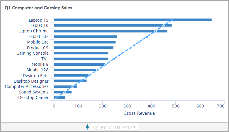
You want to sort product sales by revenue from highest to lowest in descending order.
After completing these steps, you will have a bar chart that looks like:
- Select theData Settingstab to edit the data settings.
- Expand the Sorting & Limiting section and chooseRevenueto sort by.
- SelectDescendingto set the sort order.
- For Limits, keepShow all records(default).
Set Up the Limit
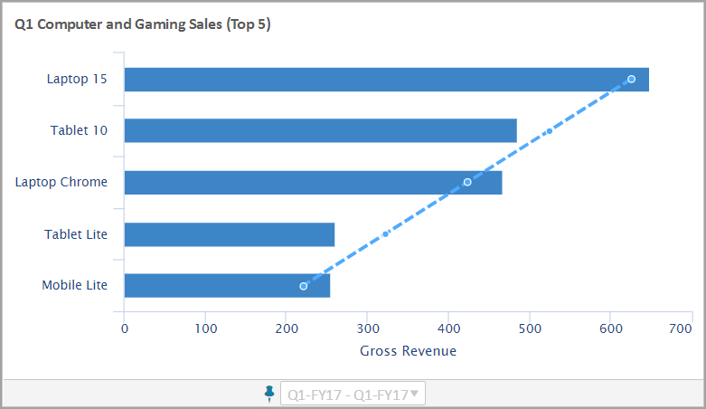
You now want to focus your analysis on the top and bottom five product sales.
- Show the Top Five Performers
- For the top five products in sales, you want to show the highest to lowest performers. After completing these steps, you will have a bar chart that looks like:
- Select theData Settingstab to edit the data settings. Keep the settings from Sort By asRevenueand Sort Order asDescending.
- ChooseFirst Nand enter5. This will limit the data to the top five performers.
- (Optional) In theAppearance Settingtab, rename the chart:Q1 Computer and Gaming Sales (Top 5)
- Create a Copy of the Bar Chart
- You want a second bar chart that shows the bottom five products in sales. You will copy the chart for top performers.
- On the chart, click .
- Right-click in the dashboard area, then clickPaste Chart. A new chart is created, active and ready to edit.
- Show the Bottom Five Performers
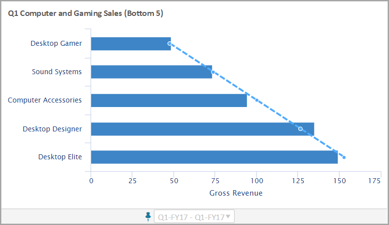
- For the bottom five products in sales, you want to show the lowest to highest performers. After completing these steps, you will have a bar chart that looks like:
- Select theData Settingstab to edit the data settings. Keep the settings from Sort By asRevenue
- Change the Sort Order toAscending.
- SelectLast Nand keep5as the limit.
- (Optional) In theAppearance Settingtab, rename the chart:Q1 Computer and Gaming Sales (Bottom 5)
This completes this walkthrough.