
Projects and Pages
Overview
In this chapter, you will create your first Extend project in App Builder, configure some basic widgets, and explore the differences between view and edit pages.
Objectives
By the end of this chapter, you will be able to:
- List the main parts of the Workday Extend infrastructure.
- Create a new Workday Extend application in App Builder.
- Use JSON to configure a PMD page.
- Save a Workday Extend application to App Hub and deploy it to a Development tenant.
- List the three metadata file types in a Workday Extend application.
- Explain key widget attributes.
- Add View and Edit PMD pages to a Workday Extend application.
Workday Extend
Workday Extend is a software development framework for building custom applications on top of the Workday technology platform. With Workday Extend, you can confidently build new features to meet your company's unique needs.
Workday Extend apps can do a variety of things, such as:
- Build off the underlying Workday object and security model, by accessing your company's existing Workday data or by creating your own unique Workday business objects.
- Use a variety of presentation widgets like buttons, calendars, or grids to quickly add user interface components that fit in with the Workday look and feel.
- Trigger real-time, event-driven processes across Workday or other external systems.
In this chapter, you will learn about the infrastructure and tooling for developing Workday Extend apps.
Workday Extend Infrastructure
When your organization purchases Workday Extend, a new company is created for them on the Workday Developer site.
- Each company has its own Workday Extend apps and its own Workday tenants.
- An app can be deployed to one or more tenants.
- Each tenant has its own unique alias
For example, the diagram below shows a company with two Workday Extend apps.
- ThemealOrder_zrclrmapp is deployed to two tenants:wdayedu_wcpdev1andwdayedu_wcpdev2.
- TheemployeeEngagement_zrclrmapp is deployed to two tenants:wdayedu_wcpdev2andwdayedu_wcpdev3.
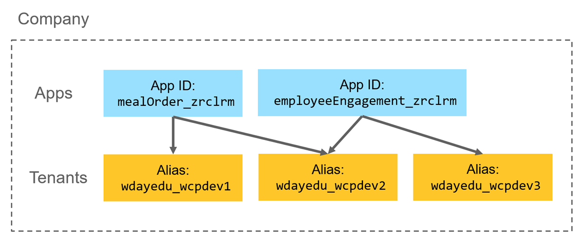
Notice that each app ID ends with the same string of random characters (i.e.,
_zrclrm
). Your company will have its own unique string of characters that gets automatically appended to the end of each app ID.Companies
A user must belong to a company in order to develop or deploy apps using Workday Extend. Users within the same company are able to share access to app development and tenant resources.
When the company is established, two Company Administrators will be assigned. These admins will maintain users and user roles. User roles include: Admin, Developer, Specialist, and Member.
Resource: Additional information on company roles and app access can be found in the Developer documentation: Concept: Companies and User Management
Development Tenants
Extend apps are built using Development tenants. These tenants are created by the company admin on the Workday Developer Site. Users with the company admin role are also able to view tenant statuses, create new tenants using GMS, AMU, or GOV tenant data, delete tenants, and reset tenant passwords.
Important: To test your app with your own company data, your company can set up your IMPL tenant for app development.
Setting this up is more complicated and requires assistance from the Workday Extend team.
Development tenants are impacted by the standard Workday weekly service updates.
We are using Development tenants in this class. Each student will have access to their own tenant, and the tenants will be deleted after the final day of class.
Tenant Aliases
Tenant aliases are automatically created when your tenant is initially created. The alias is a unique value for a specific developer tenant.
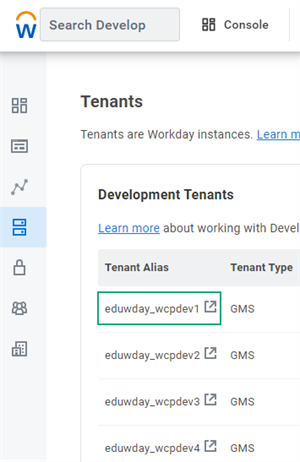
Dev Site tenant alias
Application Development Process
The following diagram illustrates the general process for building a Workday Extend app.
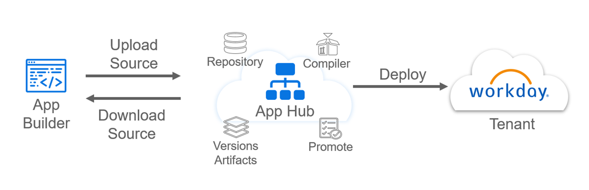
You will do the bulk of your development work in App Builder, a browser-based integrated development environment (IDE) for authoring Workday Extend apps.
When you are ready to save your work, you will save your app to App Hub. App Hub is a core service that stores the source code for your app. App Hub also consists of a build pipeline that can translate your app's source code into an artifact that can be deployed to a Workday tenant.
In this course, you will build an app gradually, one feature at a time. For each feature, you will follow a similar process:
- Build the feature in App Builder.
- Save and deploy your app via App Hub.
- Validate your changes in your Development tenant.
Using App Builder
App Builder is an integrated development environment (IDE) that is designed for creating, deploying, and testing Extend apps. It includes features like text autocomplete, syntax highlighting, and code validation.
App Builder is part of the Workday Extend Developer Site and integrates with App Hub, App Manager, and other Workday Extend tools and services.
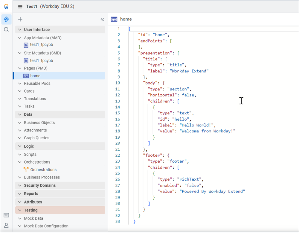
App Builder menu structure
The App Builder interface uses a variety of icons. The table below explains some of the most commonly used ones.
Icon | Definition |
|---|---|

Workday Icon App Builder menu, navigates to app overview page | Workday W Logo. Navigate to the Developer Site. |

App builder components pane toggle | Components. Collapse and expand the components pane. |

App Builder app search function | Find in App. Search for text within the files of your app. |

App Builder keyboard shortcuts | Keyboard Shortcuts. Show a list of App Builder keyboard shortcuts. |

App Builder user profile information | User Menu. Show user information, company details, and link to Feedback category of the Developer Forum. |

App Builder quick links menu | Related Actions. Show quick links to App Overview, Developer Forum, Documentation, and the Graph, REST, and SOAP API Explorers. |
Menu Structure
The left navigation pane in App Builder allows you to author app components.
This pane is broken into the following sections:
Section | Definition |
|---|---|
User Interface | Author UI components of your app: pages, reusable pods, data providers, and tasks. |
Data | Define items, such as business objects that extend your data model, or attachment objects. |
Logic | Define reusable scripts, add orchestrations, or create new business processes that let you extend the Workday-delivered business process framework. |
Security Domains | Define app specific security domains. |
Reports | Author reports for your app. |
Attributes | Edit attributes defined in the console. |
Testing | Test data or scenarios with realistic JSON responses, and protect against changing data in your tenant or external systems. |
New Pages
A page contains page metadata that defines the page widgets, data endpoints, and page interaction logic.
When adding pages to your app, consider these page elements:
- Page types, layout, and widgets
- Page interactions
- Data providers the page endpoints use
- Authentication types used by endpoint authentication
App Preview
App Preview allows you to render a page without deploying your app to the tenant. You can visualize quick UI changes and decrease development time.
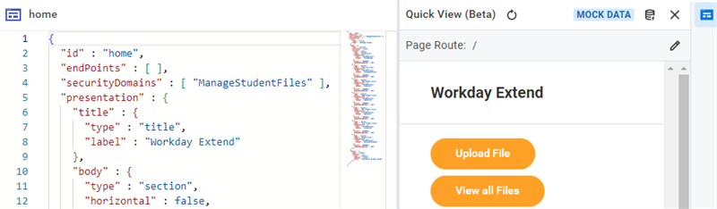
In this image, the PMD for the home page is displayed on the left. On the right, the App Preview menu item is selected and a rendering of the page is visible. This rendering is using mock data.
Selecting App Preview expands a pane that renders your selected PMD without deploying your app or changes to your tenant.
If the PMD relies on inbound or outbound endpoints, you can use the Manage Data Connection icon (it looks like a database) to connect App Builder to your tenant to render data, or you can configure and use mock data.
Important
: When App Preview connects to a tenant, the app is actually completing all inbound and outbound API calls defined on your PMD. Take care when updating data, because your updates will affect the data in your tenant and other connected systems.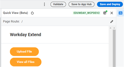
App Builder data source, connected to the tenant
Icon | Definition |
|---|---|

| App Preview. Only available when viewing a PMD page. Open the current page in App Preview. |

| Manage Data Connection. Only available in App Preview. Choose a tenant to display tenant data in App Preview, or disconnect to use mock data. |
App Builder Data source connected to the tenant | Indicates that App Preview is using tenant data, from tenant alias eduwday_wcpdev2 . |

App Builder data source connected to mock data | Indicates that App Preview is not connected to a tenant and instead is using mock data. |
Mock Data
Mock data enables you to:
- Quickly test logic and very dynamic scenarios using realistic sample JSON responses without having to change the source code.
- Protect against changing data in your tenant or in external systems.
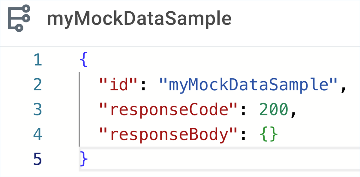
Mock data sample response
Note
: In this course, you will mainly connect App Preview to your assigned tenant.To learn more about Mock Data, refer to the Developer Documentation: Mock Data.
App Hub
App Hub is a core service that powers the app lifecycle by enabling:
- Developer collaboration.
- Version and build management.
- App deployment, promotion, and installation.
App Hub enables developers to work with App Builder, the App Manager report, and the Workday Developer Site to build, test, deploy, and maintain Workday Extend and integration apps.
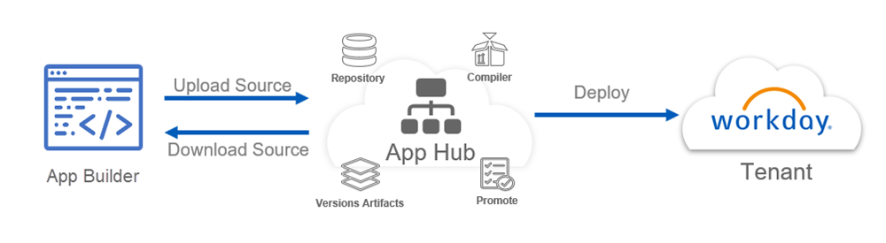
The overall App Hub service consists of 3 primary layers:
- The source code layer. This layer provides read and update operations pertaining to app source code.
- The build pipeline layer. This layer translates app source code to app artifacts. Workday environments can then consume these artifacts when you deploy or install your app.
- The artifact storage layer. This layer holds the artifacts generated as the result of a successful build.
To deploy Workday Extend apps using App Hub, you must belong to a security group on the Manage: App Manager domain security policy. Make sure you've enabled all Workday Extend security domains and have a defined security policy on each domain.
Deploying Your App
Deployment Flow: Dev Environment
Once you are ready to deploy your app to your tenant, select the Save and Deploy button. You will be prompted to select a tenant. During class, ensure that you select your assigned tenant from the drop-down list.
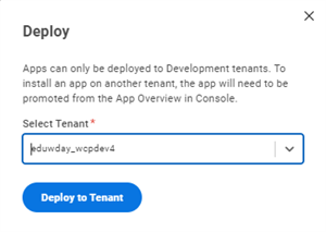
App Builder, select a tenant to deploy app
Deployment Security
In order to deploy your app, you need access to the following domain security policy: Manage: App Manager.
In your assigned Development tenant for class, Logan should already have the correct permissions. However, in your company's tenant, you may need to request access to this domain.
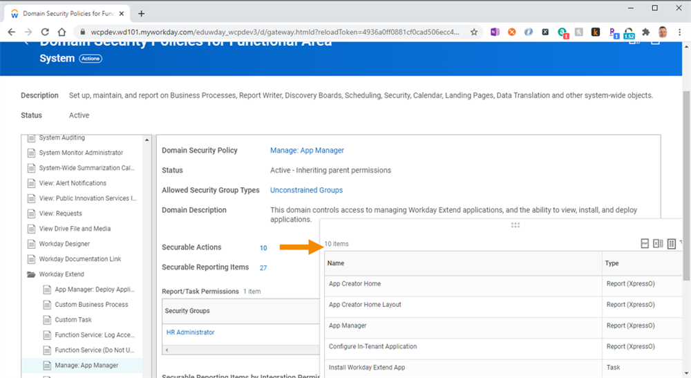
Security domain report, showing securable actions
Application Lifecycle
From the Apps page of the Developer Site, you can view a list of all of the apps you have saved to App Hub. You can also view all the apps that others in your company have saved to App Hub.
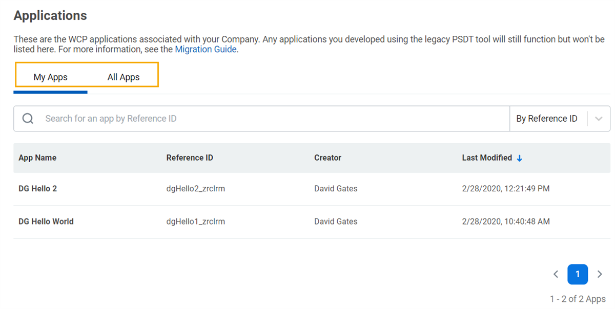
Apps That Have Been Pushed to App Hub
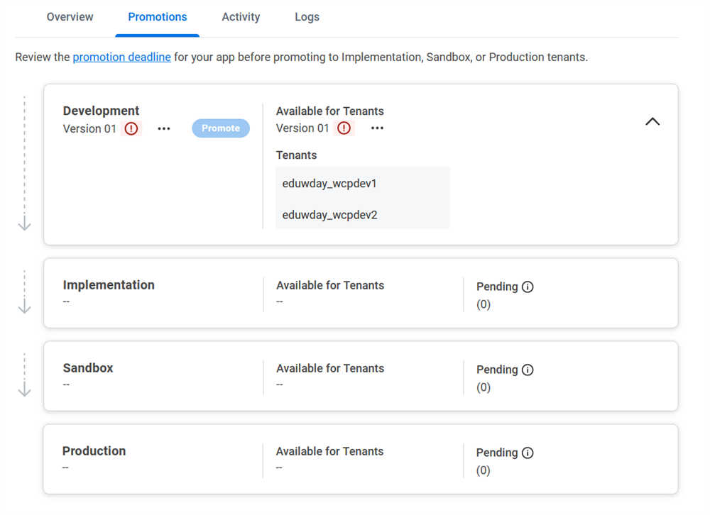
App promotion is managed on the Developer Site. Navigate to the App Overview page, then go to the Promotions tab.
There are four phases all apps should go through during development:
- Build: Create an app that brings your idea to life.
- Test: Test your app and its configurations.
- Verify: Verify that your app works in a production-like environment.
- Release: Release your app to production.
Each stage of the lifecycle corresponds to the promotion level of your app and the Workday environment in which you can run the app. Each completed cycle results in a new version of the app that you can run in your production environment.
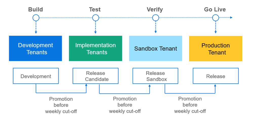
When you upload source code to App Hub, App Hub compiles the code into a build that you can promote. You promote Workday Extend apps through these promotion levels. Each promotion level corresponds to the runtime environment of the tenant on which you can deploy or install your app. You can take different actions for each promotion level:
Promotion Level
| Description |
|---|---|
Development | When you build an app, you deploy your code to a WCP Development tenant. You can update and deploy your code continuously on the Development tenant to iteratively develop your app. Note : In this course, you will only deploy to a Development tenant. |
Implementation Release
| Promote your app to Implementation Release to install, configure, and test the app on Implementation or Implementation Preview tenants. When you promote an app to Implementation Release, you:
|
Sandbox Release
| Promote your app to Sandbox Release to install, configure, and test the app on Sandbox or Sandbox Preview tenants. When you promote an app to Sandbox Release, you:
Because Sandbox and Sandbox Preview tenants are refreshed every week with production data, this is a best practice to ensure that there are no issues with your code. |
Production Release
| When you promote your app to Production Release, your Company Administrator can install and configure the app on Production tenants. |
Reminder
: Once you install an app on an Implementation, Sandbox, or Production tenant, you are no longer able to remove the app from that tenant.JavaScript Object Notation (JSON)
Workday Extend apps are written in JSON.
JSON stands for JavaScript Object Notation. JSON is a text-based format for representing data as a collection of key-value pairs.
For example, the JSON object below represents a list of three employees:
{
  "employees": [
    {
      "firstName": "Logan",
      "lastName": "McNeil"
    },
    {
      "firstName": "Aesha",
      "lastName": "Pillay"
    },
    {
      "firstName": "David",
      "lastName": "Martinez"
    }
  ]
}
JSON Rules
Here are the basic rules of a JSON document:
- The entire JSON document is enclosed in braces{}.
- JSON is a collection of key-value pairs.
- Colons separate each key and value.
- Key-value pairs are separated by commas.
- Keys and values are usually enclosed in double quotes (depends on the data type of the attribute).
- Values can be:
- A string (put in double quotes)
- A number
- true, false, null
- An object
- An array
- JSON is case-sensitive.
JSON objects:
- Are an unordered set of key-value pairs.
- Begin with a left brace and end with a right brace.
- Multiple objects are separated by a comma.
- Objects can contain nested objects. For example:{ "id": "root", "routingPattern": "/", "page": { "id": "home" } }
JSON arrays:
- Are an ordered collection of values.
- Begin with a left bracket and end with a right bracket.
- Can contain objects, separated by commas. For example:"dataProviders": [ { "key": "EXPENSE", "value": "https://api.workday.com/expense/v1" }, { "key": "COMMON", "value": "https://api.workday.com/common/v1" } ]
App Components
A Workday Extend app is made up of App Components.
App components are divided into three categories:
- Presentation components: user interface and page interactions (e.g., widgets, endpoints, page flows, custom errors)
- Model components: data (e.g., business objects, business processes, attachment objects, security domains, tasks, reports)
- Orchestration components: real-time, event-driven processes (e.g., create/update Workday data, trigger business processes, send notifications, connect to third-party APIs)
In this course, you will learn about presentation and model components.
Presentation Components Overview
Presentation components create the user interface and page interactions of an app. Use App Builder to build custom pages with JSON-based PMD tags that define:
- Widgets built on the Workday look and feel, with customizable attributes, dynamic data bindings, and event handlers.
- Endpoints that access data using Workday and third-party REST APIs.
- Flows for page navigation.
- Custom error pages.
- Pods containing common widgets across the app.
- Translated content on titles, labels, and values.
You can use PMD Scripting to perform data manipulations, calculations, and validations with the page display and interactions. You can organize your PMD scripts in shared script modules.
You can create custom tasks that open your custom pages in the Workday application. Custom tasks enable Workday users to access your app from the Home page, global search, custom dashboards, related actions, and profile groups. Users can also access your custom pages and tasks in the Workday mobile apps.
Comparing Workday to Presentation Components
While Presentation Components uses a different technology than native Workday, both Presentation Components and the Workday UI Server have two functions:
- Managing session state
- Harmonizing or transforming data
The user interface for the regular Workday application and Presentation Components apps render and look similar. But how the app pulls data and renders the pages is completely different. Here is a quick comparison of the two:
Apps... | Native Workday App | Presentation Components Apps |
|---|---|---|
Are Developed With | XPresso | Workday Extend App Builder |
Get Data From | Object Management Server (OMS) | Internal Workday Data Stores via REST APIs |
External Data Stores via REST APIs | ||
Page Definition from Meta-Data Store | ||
Input Format | Workday Meta-Language (WML) | JSON from REST APIs |
JSON from PMDs | ||
Transformer | UI Server Transformer | Presentation Components Harmonizer |
Output As | Workday User Language 2 (WUL2) | Workday User Language 2 (WUL) |
Output To | Workday UI Client | Workday UI Client |
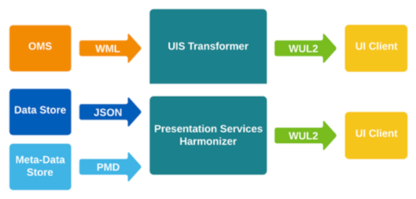
Native Workday UI transformer versus the presentation services harmonizer
Today, Workday uses a single UI server instance for multiple customers. When an end user accesses the Workday UI, other customers could be using the same server instance. However, the Workday application itself is just one app.
With the Presentation Components model, the server becomes multi-application. These applications live on multiple tenants. Because each tenant can deploy multiple apps, and each of those apps can belong to a different application area, Presentation Components is a scalable solution.
File Structures
Presentation components are metadata files that define the custom app UI. Note that all presentation component files have a size limitation of 100 KB.
AMD
Each app will have one AMD, or
A
pplication M
etaD
ata file. AMDs contain application-level arrays, objects, and properties.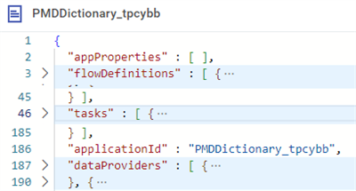
Key Elements in an AMD
App Properties
The
appProperties
array contains custom properties that you define. These properties can then be referenced in your PMD code. Each property defined in appProperties
is an object containing a key value pair.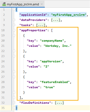
Sample appProperties
Flow Definitions
The
flowDefinitions
array contains flowSteps
and transitions
that allow you to conditionally route the user to the appropriate pages in the app. Flows are discussed in greater detail in a later chapter.Tasks
The
tasks
array contains a task for each page that is added to your app. This array becomes an index containing every page in your app. Initially, your app AMD will only have one task in the array. This task is a pointer to your home page, or home.pmd
.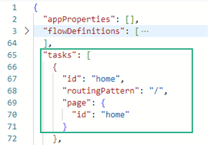
Initial Tasks Array
When you create a new PMD, the wizard asks you for the name of the page, App Builder will automatically create an associated task in the AMD
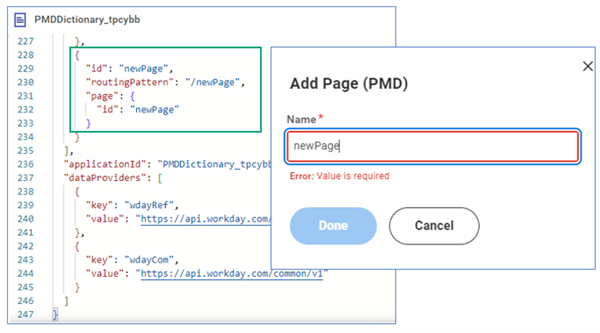
Creating a New Page Results in a New Task Being Created
Without the task, you could not access your pages. Tasks are also referenced in
button
widgets and flowSteps
.One option to navigate between pages is to create a
button
widget. The button
has a taskId
attribute that will identify which page the user will be directed to when the button
is selected. This taskId
attribute is defined in the AMD task array and references a specific PMD or page in your app.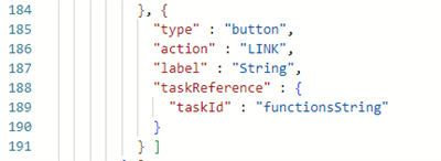
Coding a Button to Navigate to the New Page
applicationID
The
applicationId
property contains the name you provided when you created the project. This value can be referenced in your PMD code.Data Providers
The
dataProviders
array contains objects that list the base URLs for each REST API that your app will call. The objects in the dataProviders
array contain a key- value pair. These keys will be referenced in your PMD code, specifically in the endPoints
and outboundEndPoints
arrays.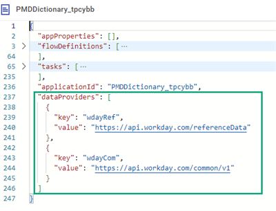
Sample dataProviders Array
AMD Documentation
The developer site has documentation on all AMD components and attributes. You can find this information by searching for "App Metadata" on the Workday Developer Site.
SMD
SMD stands for
S
ite M
etaD
ata. SMDs contain site-level arrays, objects, and properties.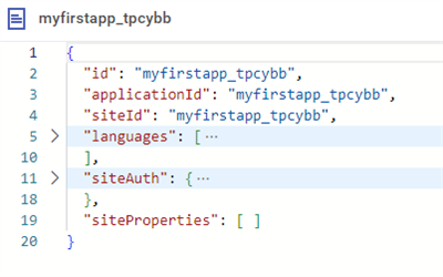
Basic SMD File
Site and Application IDs
The
siteId
property gets its value when you create the project. The SMD links to the AMD via the applicationId
property.Key | Definition |
|---|---|
applicationId | A unique identifier for the app. Can be referenced from the PMD using <% site.applicationId %> . |
siteId | A unique identifier of the site within the app. Can be referenced from the PMD using <% site.siteId %> . |
SMD Titles Array
The
titles
array of the SMD contains the application title. Presentation Components displays the title on all the page headers and on the browser tab. You can have multiple titles, each with a localized title for a specific language.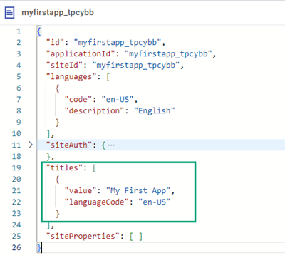
SMD titles Array
A PMD can also contain a
title
object. It is important to note that the PMD title
object does not override the titles
array in the SMD.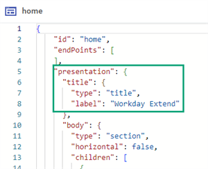
PMD title Object
Languages
The languages array resides in the SMD. The languages array contains a nested object with code and description attributes. This is used for label translation and date and time display on the date widget. The code key uses the ISO language code.
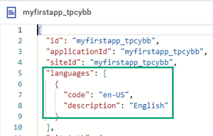
Languages Array
SMD SiteAuth
The SMD contains a JSON array named
authTypes
. In that array, you can specify any of the following authentication schemes:- NoAuth
- SSO
- OAuth2
- OAUTH_CLIENT_CREDENTIAL
- AWSV4
- WCPISU
Declare all authentication types used in your app here.
All apps default to Single Sign On (SSO). SSO uses the credentials of the authenticated user. If you are only using Workday APIs to create your app, SSO is the only auth type you need.
In a PMD, you will see endpoints that reference the auth types by their
id
. These authTypes
allow Presentation Components to attach the correct headers to your endpoint request.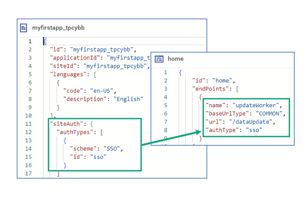
An authType in the SMD Being Used by the endPoint in a PMD
You can also specify
NoAuth
as the authType
on an endpoint, even though it is not explicitly defined in the authTypes
array.SMD Documentation
Important
: The Developer site has documentation on all SMD components and attributesPMD
Presentation Components pages are created by writing markup. Workday calls the markup presentation metadata, or PMD. You create a PMD document using JSON.
A page, or PMD, contains the following key components:
- Endpoints, which represent page data (inbound and outbound)
- Widgets, which define how you will present data to the user
- PMD Scripting
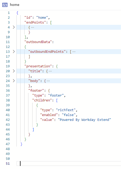
Overall PMD Structure
Note
: The term tags refers to the JSON elements you put into a PMD. So, a tag is a design-time element. Widgets refers to the control you see on the page at runtime. For example, if you add a text
tag in your PMD, at runtime you will see a text
widget.PMD Documentation
The developer site has documentation on all PMD components and attributes. Search "PMD" on the Developer site for a full list of attributes and components as well as PMD best practices.
PMD Presentation Tag
In a PMD file, you define the look and feel of your page within the
presentation
tag.The
presentation
tag contains a body
, which can contain one or more section
tags. Each section
can have:- Its own attributes, likehorizontalorsorted.
- Achildrenarray, where you define the widgets that appear on the page.
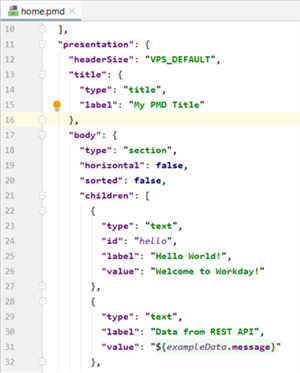
Presentation Element of a PMD
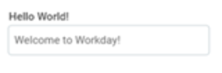
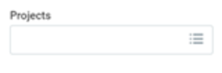
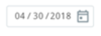
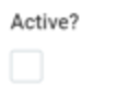
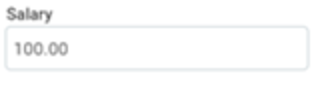
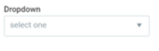
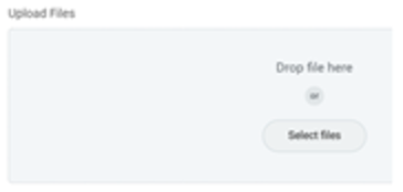
Basic Page Widgets
The table shows some basic Presentation Component widgets. You can place these widgets on your app pages. Each row shows the graphical display of the widget as well as the code to create that widget.
Display | Code |
|---|---|
|
|
|
|
|
|

|
|
|
|
|
|
|
|

|
|

|
|
|
|
|
|
In addition to the above widgets, you can also use:
- readOnlyText
- hidden
- richText
Key Widget Attributes
Here are some key attributes for your widgets:
Attribute | Description |
|---|---|
type
| The type of widget you want to use. |
id
| The reference Id for the widget. Required for dynamic bindings. |
label
| Label associated with the widget and displayed to the user. |
value
| What displays within the widget. |
required
| Used to require user input into the widget. Displays a red asterisk by the widget. |
enabled
| Allows the user to enter a value into the widget. |
visible
| A dynamic binding allowing you to show or hide the widget. Other widgets can still refer to a hidden widget. |
render
| Used to determine if you want the widget to be rendered in the DOM/HTML. Widgets cannot be seen by other widgets if not rendered. |
Introduction to PMD Scripting
PMD scripting allows you to build more interactive pages. PMD scripting uses a Java-based expression language that makes your apps event driven.
You can write scripts to:
- Manipulate data on a page.
- Set widget properties dynamically.
- Invoke an endpoint to fetch data only when needed.
To indicate a PMD script, wrap the script's contents between
<%
and %>
tags. The code snippet below includes two PMD scripts: one that calculates today's date for the Los Angeles timezone, and one that calls a function called calculateByDate
(which is defined elsewhere in the file).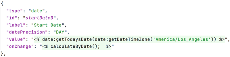
Date scripting example
PMD scripts can be executed as the user interacts with the page. You can use PMD scripting in certain attributes, including:
- onChange
- onLoad
- onRowSelect
- onSend
- onSubmit
Reminder
: Not all objects support the same interactions. Make sure you reference the documentation to verify what is supported where.Scripts can be defined at the following levels:
- Page level using the script tag.
- App level by creating script modules.
For more information about PMD scripting, refer to the "Concept: PMD Scripting" and "Reference: PMD Scripting Syntax" articles on the Developer Documentation site.
Page Types
View Page
View pages render widgets that display read-only data. You can define values from an inbound data source during page load, but you cannot dynamically set values from another widget on a view page.
Important
: View pages do not have default page navigation buttons.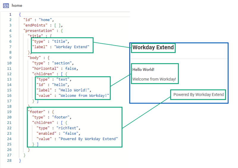
App Builder view only page
Edit Page
Edit pages render editable widgets that users can select or enter data.
Edit pages are enabled when the PMD contains
outboundData
, or the presentation
tag contains the "pageType": "edit"
key-value pair.By default, the
enabled
attribute is set to true for all widgets on edit pages, and you are able to dynamically set widget values from a data source, function, or other widget.Default navigation buttons are included in edit pages: OK and Cancel.
Button | Action |
|---|---|
OK | Submits all outbound endpoints with data entered in the widgets and navigates user to another page |
Cancel | Does not submit any outbound endpoints, and navigates to the previous page. |
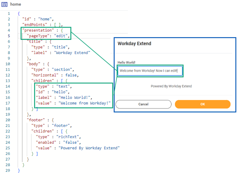
App Builder pageType: edit
Confirmation Page
Confirmation pages are configured by adding a
"pageType": "confirm"
to the presentation tag.Confirmation pages render widgets that display read-only data. The enabled attribute of all tags on a confirmation page is always false.
Like an edit page has default navigation buttons, so does a confirmation page. The Done button will navigate you the previous page. Or, if used in a flow, the Done button will take you back to the back that the flow started on.
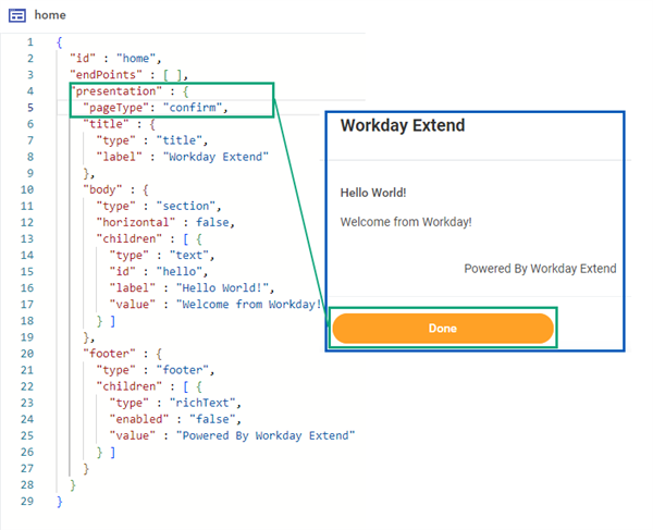
App Builder pageType:confirm