
Concept: Key Performance Indicators (KPIs)
Key performance indicators (KPIs) act as individual progress reports that together help you understand, at high-level, the overall health and performance of your organization.
Example: The key performance indicator (KPI) High Potentials Voluntary Attrition Rate shows the percentage of high potential workers that have left the company voluntarily within the set rolling period. Understanding the population that is categorized as high potentials sheds light on potential promotion and growth within the company.
People Analytics provides an out-of-the-box set of KPIs for most topics. The People Analytics Administrator selects which KPI metrics to display in the application.
Each KPI uses a People Analytics metric which is calculated by the Storyteller engine. People Analytics displays the calculation results according to your view access:
- Unconstrained access. Users see KPIs at the company level. Users can apply filters to view KPIs for specific areas of the organization and see the difference to the company value.
- Constrained access. Users see KPIs for the areas of the organization they support and KPIs at the company level for comparison.
Security settings for an individual user have an impact on which KPIs they see in the app, they also determine the minimum headcount requirements for KPIs. To learn more, see Concept: Security in People Analytics.
People Analytics displays the KPI metric and all included elements on a KPI card.
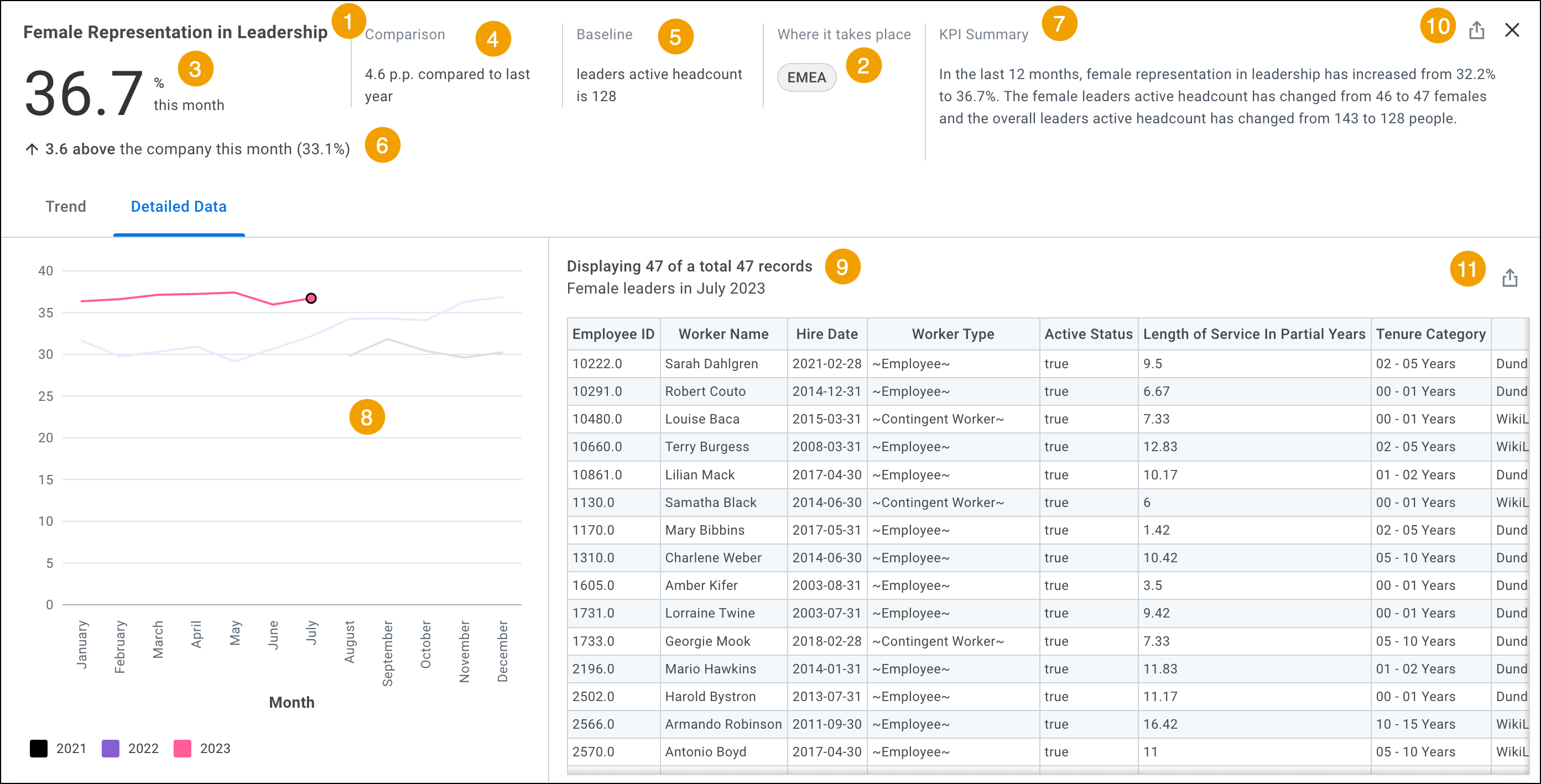
- KPI Metric.
- Focus Group.The areas of the organization for which the KPI is calculated. These are the areas of the organization that you support. The focus group can consist of 1 or more dimensions.Unconstrained users do not see this element, as the KPI reflects data at the company level.
- Current Snapshot Period Value.The value of the KPI metric for the current snapshot period (the fiscal period that People Analytics displays data for). Shows how the metric is currently performing.
- Change Value.The difference in the current snapshot period value and the historical snapshot period value. Provides a point in time comparison.If the metric uses the metric type Rate or Events Over Time, the change value is expressed in percentage points (p.p.). To learn about the difference between percentage points and percentages, see Is there a difference between percentages and percentage points?
- Baseline.Population that helps provide additional context around the given KPI metric value.
- Company KPI Comparison Value.The value of the KPI metric for the company, rounded to the nearest tenth decimal point. Helps you understand the difference in the metric performance for the focus group (see1) and the metric performance for the overall company. The company KPI comparison value uses a sentiment arrow to indicate whether the current snapshot period value for the focus group is above, below, or the same as the current snapshot period value for the company. A sideways arrow indicates the two values are the same.Because we round the company KPI comparison value to the nearest tenth decimal point, the difference between the current snapshot period value and the company KPI comparison value might not add up exactly. This is expected.The company KPI comparison value does not display for unconstrained users who are viewing the app without filters applied. By default, unconstrained users already view data at the company level.
- KPI Summary.A written summary of metric values and related population values for the focus group (or for the company, for unconstrained users). The KPI summary includes the:
- Historical Snapshot Period Value.The value for the KPI metric calculation at a designated historical point in time. The given metric and the amount of data history you have in People Analytics determine the historical point in time.When you view the KPI card at the top level (before clickingView more), you can hover over theComparisoncolumn to see a tooltip with the historical snapshot period value.
- Trend Chart.A graphic that demonstrates how the KPI metric changed over time. The amount of data history you have in People Analytics determines the number of months that display on the chart. The maximum number of months the chart can display is 36 months.The trend chart displays on theTrendtab and theDetailed Datatab on a KPI card.
- Detailed Data tab.The detailed data records for workers included in the focus group (or in the company, for unconstrained users). The records are available for the current snapshot period as well as historical periods that display in the trend chart. People Analytics configuration inputs set by the People Analytics Administrator determine which records are included in the detailed data.
- Export to Discovery Board.This function enables you to export the detailed data table on a KPI card to a new or existing discovery board.