
Concept: Focus Insights
Most topic tabs in People Analytics have a set of out-of-the-box, key workforce business questions. Focus insights, generated by the Storyteller engine, answer these business questions using People Analytics metrics. Focus insights help you determine risks and action opportunities that display as trends and gaps in your people data. For more information on Storyteller, see Concept: Storyteller Engine.
Focus insights display how a metric is performing now in comparison to a historical point in time, or how a metric is performing in one area of the organization in comparison to another area of the organization, or the company. To learn more about People Analytics metrics, see Concept: Metrics in People Analytics. To learn more about metrics available in People Analytics, Reference: Metrics in People Analytics.
Each focus insight uses a People Analytics metric which is calculated by the Storyteller engine. People Analytics displays the calculation results according to your view access:
- Unconstrained access. Users see focus insights at the company level. Users can apply filters to view focus insights for specific areas of the organization.
- Constrained access. Users see focus insights for the areas of the organization they support.
Security settings can impact which focus insights display in the application for unconstrained and constrained users. To learn more about how Workday applies security to People Analytics data, see Concept: Security in People Analytics.
Focus Insight Card
People Analytics displays the focus insight and all included elements on a focus insight card.
This focus insight compares the metric performance in 2 areas of the organization with another, different area of the organization. You can access this expanded view of a focus insight card by clicking
View More
on a focus insight card.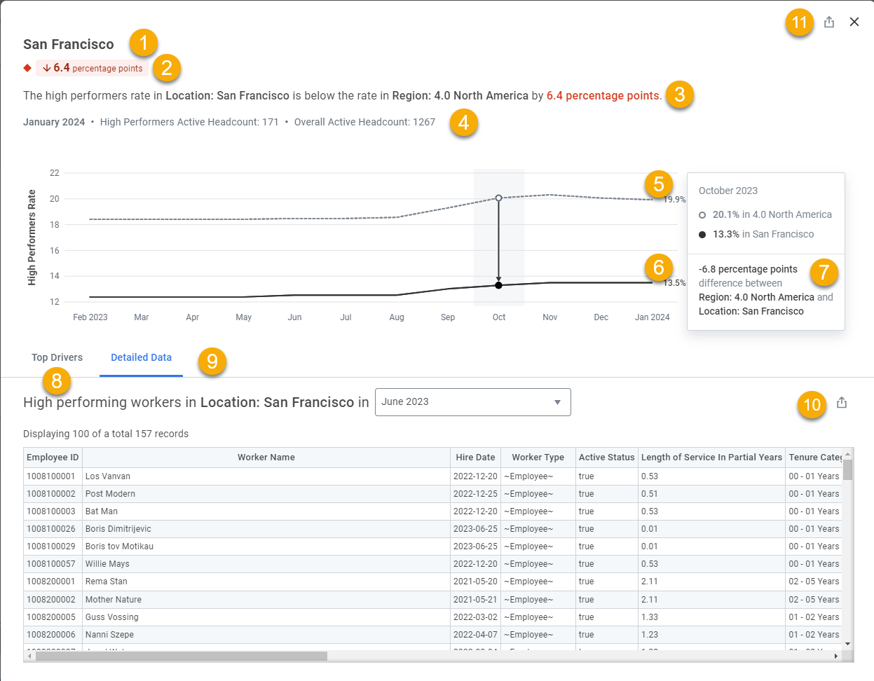
- Focus Group.The area or areas of the organization where the focus insight takes place and for which the focus insight metric is calculated. The focus group can consist of 1 or more dimensions.
- (6.4 percentage points)Shows the:
- Metric Difference Value.The value of the difference between either the:
- Current snapshot period value and the historical snapshot period value, or the
- Current snapshot period value for the location group and the current snapshot period value for the comparison group.If the metric uses the calculation type Rate or Events Over Time, the metric difference value is expressed in percentage points (p.p.) (For difference between percentage points and percentages, see FAQ: People Analytics).
- Sentiment.The shape and color of the Metric Difference Value. Indicates whether the metric has trended in a positive (green circle) or negative (red diamond) direction or if the trend has been neutral (black square) since the previous snapshot period.The expected result for select metrics can vary across organizations, as some metrics don't follow a universally accepted trend. To address differences in metric trends across organizations, we set a target range for these metrics:
- Average Span of Control for values between 5-15.
- Female composition for values between 40-60%.
We display movement within these ranges in a neutral color. Movement towards these ranges displays in green, while movement away from these ranges displays in red. All changes for the metric Average Target Compensation display in a neutral color, as individual cases can determine whether an increase or decrease is expected.
- Focus Insight Summary.A written summary of the metric trend.
- Focus Group Details.Display the current snapshot period and parameters used in the calculation of the metric.
- Displays the:
- Comparison Group.The group that is used as a comparison to the focus group for the focus insight. Comparison groups have only 1 dimension within a hierarchy. The associated business question determines whether the focus insight uses a comparison group.
- Current Snapshot Period for the Comparison Group.The value of the metric for the current snapshot period (the fiscal period that People Analytics displays data for) for the comparison group.
Some focus insights don’t have a comparison group. - Trend Chart.A graphic that demonstrates how the metric changed over time. The amount of data history you have in People Analytics determines the number of fiscal months that display on the chart. The maximum number of fiscal months the chart can display are 36.
- Historical Snapshot Comparison tooltip.Displays the difference between the metric value and the comparison group value at a historical point in time. By hovering over the graphic, you can review these for every available fiscal month.Because we round all values to the nearest tenth decimal point, the difference between the focus and comparison group values might not add up exactly. This is expected.
- Top Drivers tab.Displays the top drivers for the focus insight. For details, see theTop Driver tabsection below.
- Detailed Data tab.Displays the detailed data records for workers that are included in the metric calculation. The records are available for the current snapshot period as well as historical snapshot periods that display in the Trend Chart. People Analytics configuration inputs set by the People Analytics Administrator determine which records are included in the detailed data.
- Export to Discovery Board.Enables you to export the detailed data table on a focus insight card to a new or existing discovery board.
Top Drivers Tab
This image shows the
Top Drivers
tab for the focus insight in the image above.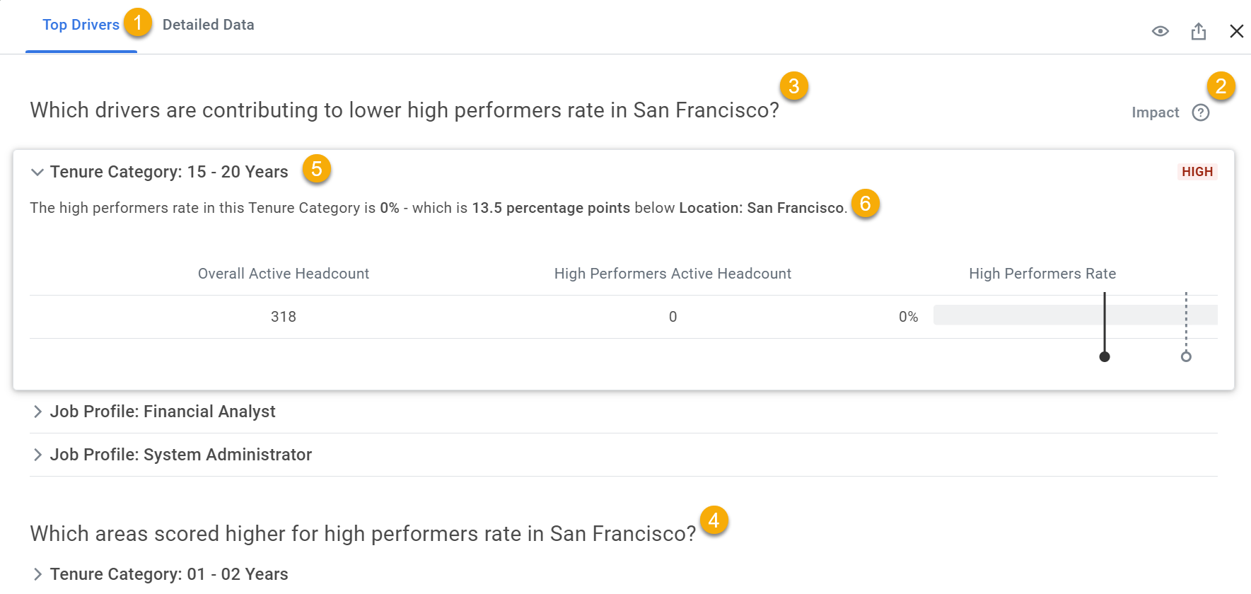
- Top Drivers tab.Displays the top drivers for the focus insight. Top drivers are the dimensions that have an impact on the metric trend for the given focus insight. Top drivers can reflect dimensions that contribute to the metric performance or dimensions that drive the metric trend in the opposite direction.
- Impact.People Analytics uses theHigh Impactlabel to indicate top drivers that Storyteller analyzed as having a high impact.
- Contributing Top Drivers.Top drivers that reflect dimensions which contribute to the metric performance.
- Divergent Top Drivers.Top drivers that reflect dimensions that drive the metric trend in the opposite direction.
- Top Driver.
- Top Driver Summary.The written summary of the metric impact that the given top driver (dimension) has on the focus insight.