
Steps: Add Graphs to Reports
Add Excel Sparklines to a Report
Sparklines
are miniature charts placed in single cells, each representing a row of data in your selection. You can define the data included and the format and colors of the sparkline. The data the sparkline is based on is in a single row in the report.
The three main formats are the
Line
, Column
, and Win/Loss
sparklines: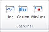
To create a sparkline:
- Select the cell where you want to insert the sparkline.
- On theInserttab, in theSparklinesgroup, clickLine,Column, orWin/Loss. The Create Sparklines dialog appears.
- Place your cursor inData Range.Select the cells containing the data you want to represent in the sparkline.
- Click inLocation Range.
- Select the cells where you want to place the sparklines.
- ClickOK. The sparklines appear as you specified.
Add Excel Data Bars to a Report
Data bars
are a set of solid or shaded colored bars that you add to a cell to visually represent the value in that cell. The higher the value, the longer the bar. The highest value in a group of data bars is 100% shaded, with every other value shaded as a percentage of that highest value. To add data bars to your report:
- Select the cells you want to include in a single evaluation group. These are the cells that will be compared to each other in the data bar set.
- On theHometab, in theStylesgroup, clickConditional Formatting.Point to Data Bars, and then choose the color you want from theGradient FillorSolid Fillsections.
- For additional options, clickHome>Styles>Conditional Formatting>Data Bars>More Rules. The New Formatting Rule dialog box appears. Specify the conditions you want for your data bars.
Add Excel Icon Sets to a Report
Like data bars, an
icon set
is a conditional formatting option. You can use an icon set to help those viewing your report quickly visualize the highest and lowest values in a group, values within defined ranges, or values that meet specified criteria. To add an icon set to your report:
- Select the cells you want to include in a single evaluation group. These are the cells that will be compared to each other in the icon set.
- On theHometab, in theStylesgroup, clickConditional Formatting, point to Icon Sets, and then choose the type of icons you want to use.
- For additional options, clickHome > Styles > Conditional Formatting > Icon Sets > More Rules.TheNew Formatting Rule dialog appears, in which you can specify the conditions and options you want for your icon sets.