
Example: Use Bar Charts to Focus on Key Data Points
Suppose that you want to create a visualization that shows the lowest performing sales regions in the United States. This walkthrough will show you how to use data-focusing techniques and narrow the focus of a chart on key data points. When you complete this walkthrough, the chart will look like:
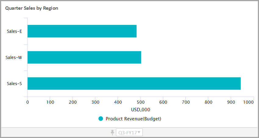
This walkthrough will explain how to create a bar chart that visualizes prior quarter revenue broken down by sales region. You will:
- Set up a filter on the data series in the chart. You will filter revenue to evaluate only United States sales regions.
- Define a breakdown on the data series by the level dimension.
- Sort and limit to show the lowest performing regions.
Prerequisites
Prerequisites
- Edit access to a personal or shared perspective.
- Security:
- Access Dashboardspermission.
- Edit Dashboardspermission.
This example uses the default version
Working Budget
and the following:
- Revenuegeneral ledger account
- Leveldimension with dimension members that includes United States sales regions
Your versions and data sources may be different than the ones illustrated in this example.
Navigation
 Navigate to
 Dashboards
Navigate to the perspective and dashboard select
Edit
to create a chart.Create a Bar Chart
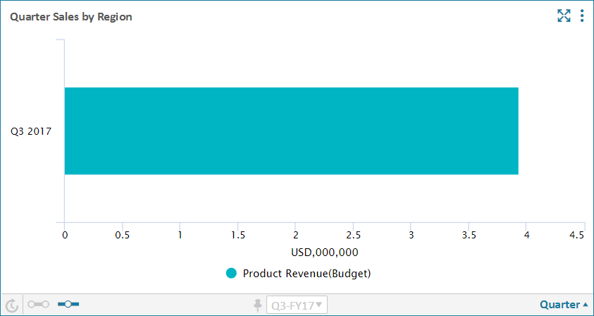
You will create a bar chart and change time settings. After completing this step, your chart will look like:
- Create the Chart
- In the left panel, click theChartstab to view a list of chart types. Drag theBarchart to the design area to create a bar chart.
- In the left panel, click theAccountstab to view a list of accounts. Drag a revenue account to the chart.
- On theAppearance Settingtab, rename the chart:Quarter Sales by Region
- Change the Time
- You will change the time settings to look like:
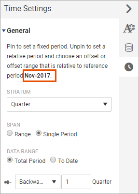 The time set in perspective context isNovember 2017, which falls in the third quarter. The time setting in the chart is set to relative time. The chart looks at data back one quarter based on the time set in the perspective context. The chart visualizes data for the second quarter representing July, August, and September.
- Click theTime Settingtab to change time to prior quarter. Change the following settings:
- Stratum: Quarter
- Span: Single Period
- Data Range: no change required
- Unpin time to set to relative time (a gray pin indicates unpinned). Do the following to set time to the prior quarter:
- SelectBackwardsfrom the drop-down
- Enter1(to go back one quarter)
Narrow the Data Focus
You will use filtering, breakdown, and sorting and limits to focus on the lowest performing sales regions.
- Add a Data Series Filter
- You will change the data settings to filter the revenue data series. You will filter using the Level dimension and United States sales regions. After completing this step, the chart will look like:
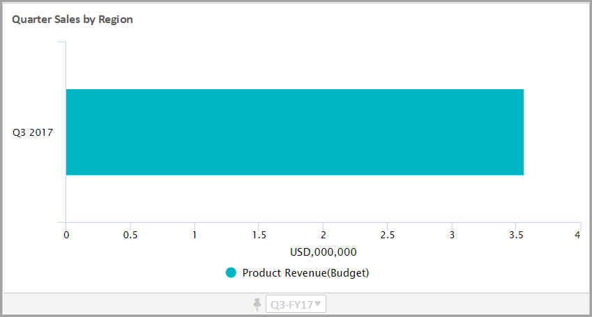 At this point, there may not be a significant change to the chart. The total value of the data series may be the only noticeable difference.Do the following:
- Click theData Settingtab to edit the data settings.
- Expand theProduct Revenueaccount to change the settings on the data series.
- Expand the Filter setting and navigate to Levels element, then select each individual region that you want to include in the analysis. The selections display in the Filter setting.
- Change the Breakdown
- Use the breakdown to categorize (or group) data. You will group revenue by sales region using the Level dimension. After completing this step, the chart will look like:
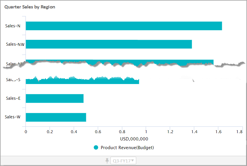 Do the following:
- Click theData Settingtab to edit the data settings and expand theBreakdownsection.
- ChooseDimensionfrom the drop-down (Time is the default).
- Expand the Dimension setting and select Level from the list.
Do not change the remaining breakdown settings.
Sort and Limit the Data
You can sort the data, such as by highest to lowest revenue. For this analysis, you are interested in poor performing sales regions. You will change the data settings to:
- Sort by product revenue in ascending order.
- Limit data to the three lowest performing regions.
After completing these steps, the chart will look like:
- Click theData Settingtab to edit the data settings and expand theSorting and Limitsection. Choose the following:
- Sort By:ProductRevenue
- Sort Order: Ascending
- To limit to the three lowest performing regions, selectFirst Nfrom the drop-down and enter3as the limit.
This completes this walkthrough.