Concept: Conditional Formatting for Charts
You can apply conditional formatting to most Reference: Chart Types, except waterfall, sheets, and dimension mapping. Use the Appearance Settings tab to define how to format data that meet certain conditions. Conditional formatting is rule-based that evaluates to true or false. If true, the condition is met and the data is conditionally formatted in the color specified. Rules must reference a data series in the chart.
Suppose you want to highlight good liquidity in a chart when the quick ratio is higher than 2. You can create an expression:
[quick Ratio] > 2
that evaluates true or false. If true, the data point is formatted in green.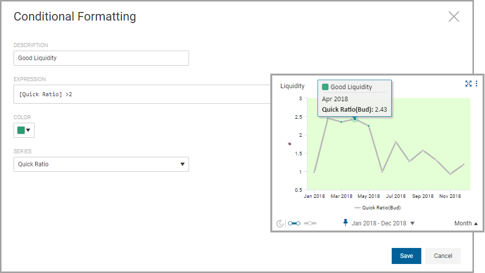
Display Styles
Charts display data as a numeric value or graphically such a bar or column. The display style for a conditionally formatted data point will vary based on the chart type.
Charts with a Numeric Display Style
Conditional formatting is applied to the numeric value on these charts:
- Crosstab
- KPI
- Scorecard
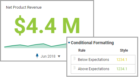
For example, this KPI is highlighted in green indicating that 4.4 million in revenue is above expectations:
Charts with a Graphic Display Style
Conditional formatting is applied to the graphical representation of data to these charts:
- Area and Line
- Bar and Column
- Doughnut and Pie
- Funnel and Pyramid
- Gauge and Meter
- Geo Map
- Scatter
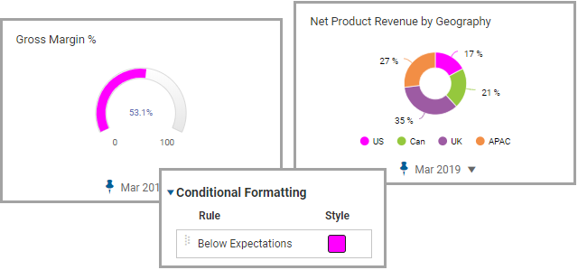
For example Gauge charts conditionally format the scale and doughnut charts conditionally format data slices in pink when gross margin or revenue falls below expectations: