
Reference: Data Breakdown
Breakdown settings slice data in categories or segments, such as by time period, sub-accounts, or dimensions. You can set the breakdown from the Data Settings tab of a chart. All chart types have data breakdown options except for: Gauge, KPI, Crosstab, and Scorecard charts.
Breakdown Options | Descriptions | Chart Type |
|---|---|---|
Dimension | Breaks data into categories for in-depth analysis, such as Sales Channel, Location, Product, and many other possibilities. | Area, Bar, Column, Doughnut, Geo Map, Line, Pie, Pyramid |
None | Accounts are not broken into categories. | Area, Bar, Column, Line |
Metric | Breaks data into categories as defined by the account. For example, a waterfall can break data down by Sales metrics: Total Revenue, Cost of Sales, Gross Profit, Admin Costs, and Net Profit. | Waterfall |
Series | Breaks data by a series as determined by the accounts added to the chart. For example, if you breakdown data by series in a Revenue pie chart, slices are product, service, and maintenance revenue. | Doughnut, Funnel, Pie, Pyramid |
Time Stratum or Time | Breaks account data into time periods, such as month, quarter, and year based on the Time Settings configured on the chart. | Area, Bar, Column, Doughnut, Geo Map, Line, Pyramid, Waterfall |
Second Breakdown
For area, bar, column, and line charts, you can set a first and second breakdown to group and analyze more granular slices of data. For example, you can analyze yearly revenue by quarter, and then breakdown the data further by location or product.
Column and Line Chart Breakdown Examples
Breakdown by Time
This example shows a stacked column chart with breakdown by time. The data setting inset shows that the breakdown Type is
Time
and Stacked is on.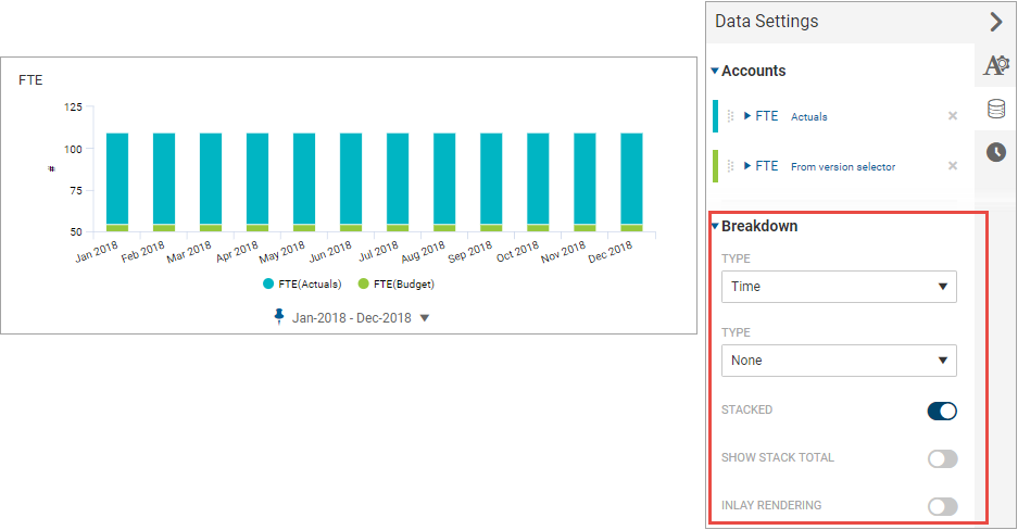
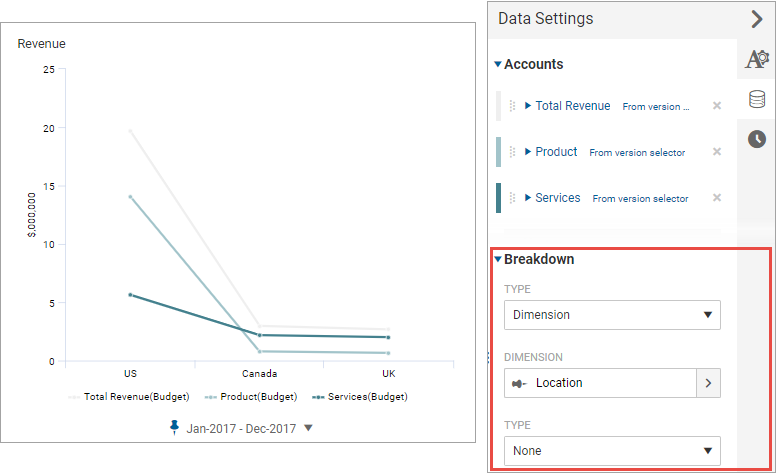
Breakdown by Dimension
This example shows a line chart with a breakdown by the location dimension. The data settings inset shows that the breakdown Type is
Dimension
and selected dimension member is Location
.
Suppress Zeros
Suppress zeros to focus your visualizations on relevant data points when you breakdown charts by dimension in
Data Settings
> Breakdown
. To suppress zeros in scorecards and crosstabs:
- For scorecards, suppress zeros inAppearance Settings > General.
- For crosstabs, suppress zeros inData Settings > ColumnsorData Settings > Rows
No Breakdown
This example shows a stacked bar chart without any breakdown. This set up is useful for comparing ratios among several data series. The data settings inset shows that the breakdown Type is
None
and Stacked is on.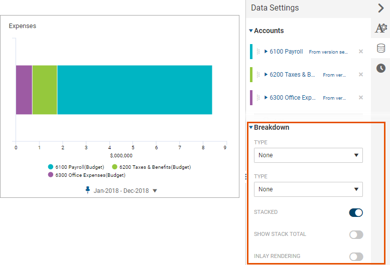
Pie, Doughnut, and Prymid Chart Breakdown Examples
You can break pie and doughnut charts by series, time, or dimension.
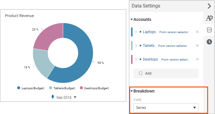
Breakdown by Series
This example shows a doughnut chart with a breakdown by series, which each slice represents a data series. The data settings inset shows that the breakdown Type is
Series
.
Breakdown by Dimension
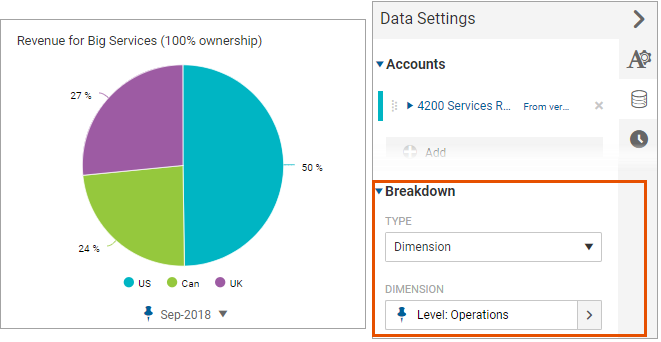
This example shows a pie chart with a breakdown by dimension, where each slice represents revenue for a location of a wholly owned company. The data settings inset shows that the breakdown Type is Dimension and the selected dimension member is
Level > Big Services (100% Owned) > Operations
.
Breakdown by Time
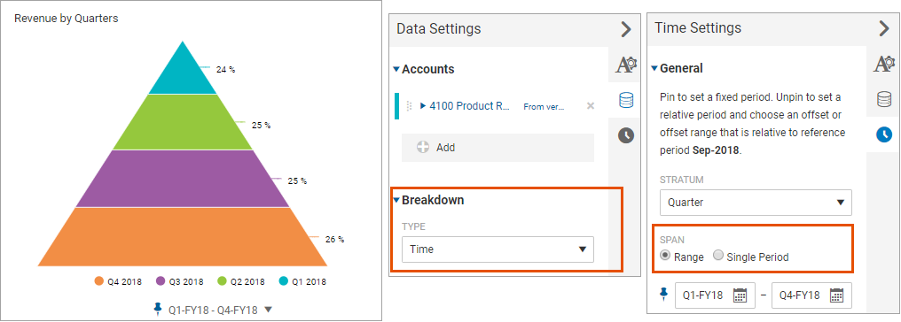
Sometimes, it makes sense to breakdown data in a pie, doughnut, or pyramid by time. To show a data series broken down by time segments, you must define a time span range.
This example shows a pyramid chart with a breakdown by time. Each slice represents a time period. The data settings inset shows that the breakdown Type is
Time
. The time settings inset shows that the span is set to Range
.
Waterfall Breakdown Examples
You can break waterfall data down by metric, dimension, or time.
Breakdown by Metric
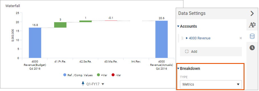
The following is an example of a waterfall that compares planned revenue to actuals for the previous year. The breakdown is by metric, where each step is revenue for three product lines. This chart represents a default configuration for a waterfall chart.
Breakdown by Dimension
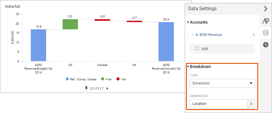
The following waterfall chart shows breakdown of revenue by the location dimension.
Breakdown by Time
The following waterfall chart shows breakdown by time. This chart helps you visualize how revenue was recognized each month in Q3.
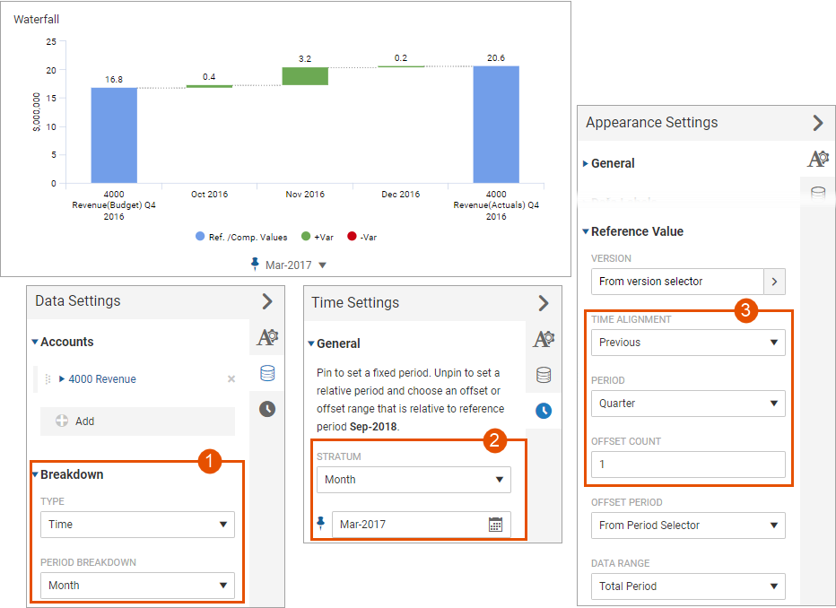
To set up this visualization, you must set up time elements in all settings types:
1 | Data Settings: Choose Breakdown by Time . |
2 | Time Settings: Set Stratum to Month . |
3 | Appearance Settings: Set the Time Alignment for the Reference Value to Previous , Period to Quarter and Offset Count to 1 . |