You will learn how to create three sections with columns that visualize plan-to-actuals for the current period, year-to-date, and a forecast. This walkthrough uses the default version
Working Budget,
and
additional versions for
Actuals,
and
Forecast.
And the following custom accounts for operational metrics:
Availability
Downtime
Overall Equipment Effectiveness
Your versions and data sources may be different than the ones illustrated in this example.
Navigation
Navigate to
Dashboards
to
display all perspectives.
Open the perspective, open the dashboard, and click
Edit
to create a chart.
Create a Scorecard
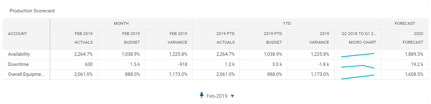
These steps explain how to create a scorecard and add an account to the chart. After completing these steps, the scorecard will look like:
On the left panel, select the
Charts
button to choose a chart. Drag and drop the
Scorecard
chart to add the scorecard to your dashboard.
Select the
Accounts
button to choose accounts. Drag and drop the
Custom > Operational Metrics > Availability
account to the scorecard. The scorecard template populates the chart with default sections and columns.
In the right panel, click the
Appearance Settings
button to change the Appearance settings.
Expand the
General
section and change the name to
Production Scorecard.
Change the Scorecard Sections
In this step, you will reorganize the scorecard:
Delete the quarter section.
Change the data range of the Year section.
Add a section for forecast.
After completing these steps, the scorecard will look like:
Remove a Section
Click the
Appearance Settings
button and expand
Sections
.
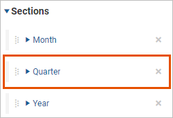
Select
X
next to the
Quarter
section:
A confirmation displays.
Change the Data Range in the Year Section
You will change the Year section to show year-to-date.
With
Sections expanded,
expand the Year section, and rename the section to
YTD
.
In the Year section, change the Data Range to
To Date
for the Actuals, Budget, and Variance columns in the Year section. The scorecard displays the YTD section name and the date format for the Actuals and Budget columns changes to
2019 PTD
to indicate to-date data.
In the Year section, change the format of the micro chart:
Time Alignment: Trailing
Period Count: 4
Period: Quarter
Data Range: To Date
Chart: Line
Add a Section to Show a Forecast and Finish
You will add a single column section that represents a forecast. As a last optional step, add two more accounts. After completing these steps, the score will look like:
Click the
Appearance Settings
button and expand
Sections
.
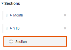
Select the
New Section
button to create a new section:
Expand the new section and rename to
Forecast.
Expand the column,
Value
. Change the settings to show the forecast for next year:
Version:
Forecast
Time Alignment:
Next
Period:
Year
Offset Count:
1
(sets the relative period to 1 year in the future based on the current period)
Keep all other defaults
The column header in the scorecard changes to
<YYYY> Forecast
.
Optionally add few more data series, such as
Downtime
and
Overall Equipment Efficiency
. Two ways to add more data series:
From the Data Settings tab, select the
Add
icon and select an account.
From the Accounts tab in left panel.
You can always add all data series when you first create the scorecard. For your first scorecard, start with one data series to reduce clutter and help you focus designing the chart. Once you get close the final design, add the other data series.

 Navigate to

 A confirmation displays.