
Example: Create a Crosstab to Slice Data with Dimensions and Time
A
crosstab
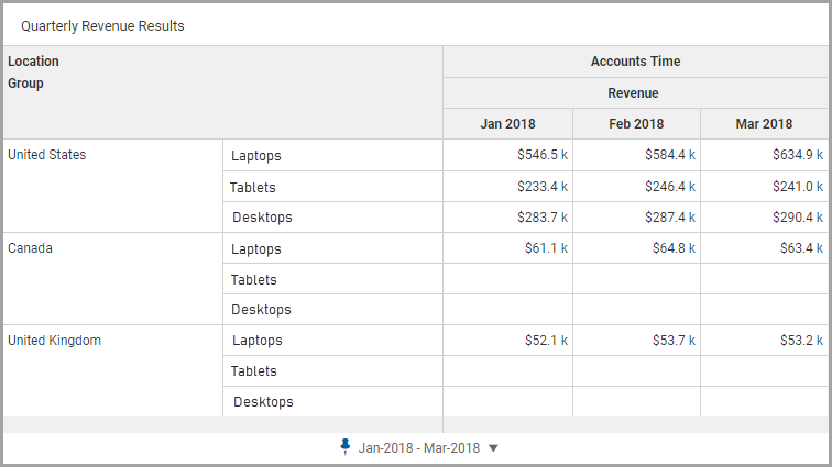
visualizes data in tabular format. This chart is often used to compare relationships between data sets.This walkthrough explains how to create a crosstab for a quarterly review. This chart will visualize revenue that slices data by location and product groups.
Prerequisites
Learn about Concept: Crosstab Charts, its structure, and how to slice data.
Prerequisites
You need:
- Edit access to a personal or shared perspective.
- Security:
- Access Dashboardspermission.
- Edit Dashboardspermission.
This example uses
Working Budget
as the default version and the following accounts and dimensions:
- Columns: Revenue Cube account
- Rows: Location dimension broken down by Group dimension
Techniques for Adding Data to a Column or Row
- Add a Column or Add a Row
- You can add accounts, dimensions, or time as a column or a row. You can only add accounts or time as a column or row not both.From the Column section or Row section, select theAddicon and selectAdd DimensionorAdd Timefrom the drop-down. If a specific dimension or Time is used once as a column or row, it cannot be reused in the same chart and will be unavailable for selection.
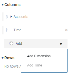 To reorder, use the Handler icon
 to drag and drop the the dimension or Time from to the new position within the column or row. The chart reflects this change.
 - Dimensions as a Column or Row
- When you selectAdd Dimension, a selection panel displays. Select the dimension, attribute, or dimension member to add as a column or as a row.If the dimension member has no breakdown data, a message is displayed on the chart upon selection:No break down is available for the following dimension members: [member names]Remove dimension members or pin the selection to default to the parent dimension member or dimension. Click thePinicon
 next to the dimension to pin: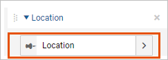
Create a Crosstab Chart
In this walkthrough, add a crosstab chart to a dashboard, add the revenue account as a column, and change the default time settings.
After completing these steps, you will have a crosstab chart that looks like:
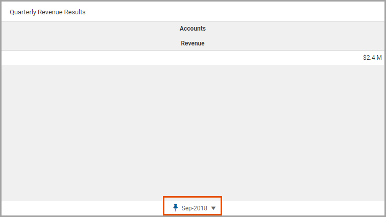
The selections in the Time Setting tab determine the time scope. The initial period in this example is current month and year.
- Navigate to the perspective and dashboard for the new chart.
- ClickEditfrom the toolbar to make changes to the dashboard.
- In the left panel, click theChartsbutton to view a list of chart types. Drag and drop theCrosstabchart to the design area to create a crosstab chart.
- In the left panel, click theAccountsbutton to view a list of accounts. Drag the Revenue account to the chart.
- In the right panel, click theAppearance Settingsbutton to change the appearance of the chart.
- Click theData Settingsbutton to view the data settings. Note that by default theRevenueaccount is a column and no rows are defined.
- Add Time as Columns
- You want to show revenue for each month in the quarter. You will add the Time dimension as a column and change the Time Settings for the quarter in review.After completing these steps, you will have a crosstab chart that looks like:
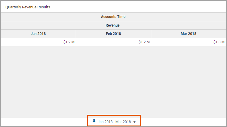
- In theData Settingstab, select theAddand selectAdd Time.
- Click theTime Settingsbutton to edit the time settings. Change pinned time:
- Stratum: Month
- Span: Range
- Data Range: Total Period
- Pinned time: Jan-2018 - Mar-2018
- Add Location as Rows
- For this crosstab chart, you want to compare product revenue for each sales location. You will add the Location dimension as a row and add the Group dimension to break down data by product line.After completing these steps, you will have a crosstab chart that looks like:The selections in the Time Setting tab determine the time scope. The initial period in this example is current month and year.
- In theData Settingstab, navigate to the Rows section.
- SelectAddto add a new row. SelectAdd Dimensionfrom the list. From the selection panel, navigate to the dimension:Location.
- Select theAddicon and selectAdd Dimension. From the selection panel, navigate to the dimension attribute:Group.
This completes this walkthrough.